Conclusively confirmed:
There is no “AGW”. Only “SGW”.
The Sun (+ASR; not TSI. A-S-R!) did it.
The “GHE” (–OLR) didn’t.
Read on …
PREAMBLE
What do we need data for in science? We use observational data to test the validity of our ideas about the world. Mother Nature has a tendency to give out clues for us to discover as to how the cogs and wheels of her grand internal machinery actually fit together to make the world go round. All we need to figure out, really, is what to look for and where to look. Normally, the most important relationship for us to pin down whenever we observe a certain physical phenomenon or process out in nature, is the one connecting (and thus determining) ’cause’ and ‘effect’. This, however, is quite often harder to do than you’d think, and many people get confused and inadvertently end up having the two mixed up.
An apt case in point: A positive feedback is essentially an effect that amplifies its cause; in other words, it causes the initial magnitude of what caused it to increase. There is never a feedback without an original cause. The feedback has to be an effect of, a response to, something. It feeds back. What we commonly see in the Earth system is the root cause and its feedback(s) working cotemporally, meaning, they overlap in time. The cause came first, of course, but as soon as the cause produced a feedback to start affecting the magnitude of the original input, positively or negatively, we basically entered a so-called “feedback loop”, the cause and its feedback(s) now being next to impossible to distinguish if you didn’t know exactly what to look for. Because the ’cause process’, feeding the feedback, and the ‘feedback process’, feeding back to the cause, essentially run in parallel.
And this is precisely why we need to keep such a close watch on the observational data. It makes us aware of things like this. It enables us to separate between original causes of observed physical phenomena within the Earth system and mere feedbacks to (effects of) those causes.
If we only know where to look …
And remember, now: We use observational data to test the validity of our ideas about the world. Our ideas never get to decide upon the validity of the data. Our map never gets to dictate what the terrain should look like.
And don’t you ever forget it!
Good (as in ‘objectively validated and quality-tested’) data is good data, regardless of how I feel about it.
And with that …
THE ‘GLOBAL WARMING’ STORY
AS TOLD BY THE DATA
– BACKGROUND / PREMISE –
A combined analysis of OHC (“Ocean ‘Heat’ Content”) and ToA (“Top of Atmosphere”) radiation flux data unequivocally reveals what caused global warming between 1977 and today. And what didn’t.
The OHC data (NOAA/NCEI) effectively shows one specific ad hoc argument commonly advanced by “AGW” proponents as if it conveyed some kind of intrinsic truth about ‘global warming’ to really have no merit, to be nothing more than a specious assertion unsupported by any real-world observations. That argument conveniently implies that the observed increase in ASR (“Absorbed Solar Radiation” / net SW / TSI minus albedo; the solar heat flux to the Earth) since 1985 (ERBS+CERES) is somehow simply a (positive SW) feedback to, that is, an amplifying effect of, prior “greenhouse” warming (from a decrease in OLR (“Outgoing Longwave Radiation”; Earth’s heat flux to space).
As it turns out, this particular argument developed from the simple output of climate model simulations, and finds real support in those very same climate models ONLY. Discussed more in depth in the neighbouring post (“Addendum II”).
We all agree, of course, that a net accumulation of energy – and thus, warming – over time within the Earth system can only come as a result of a positive heat imbalance (or ‘net flux’) at the ToA; that is, if the incoming heat flux from the Sun (the ASR) is consistently larger than Earth’s own outgoing heat flux (the OLR): Qin > Qout = +Qnet → +U → +T.
It should also be pretty uncontroversial to posit as true that this particular kind of imbalance (Qin > Qout) could come about in two ways only:
- Either through increasing the heat gain (+Qin, +ASR), or
- through reducing the heat loss (–Qout, –OLR); the “Greenhouse Warming Mechanism” in a nutshell.
So if we were to start from a relatively balanced state, the net flux at the ToA seemingly fluctuating fairly evenly over a certain stretch of time around neutral, some perceived zero line, meaning that no significant amounts of energy can be observed to accumulate inside the Earth system within that time frame, then we will either 1) have to increase the heat INPUT from the Sun to the Earth system, or 2) reduce the heat OUTPUT from the Earth system to space, in order to break that dynamic balance and cause new warming to occur.
In other words, from such a balanced state, net accumulation of energy, directly associated with system warming, can’t start up as a mere positive feedback, because there’s nothing for it to be a feedback to, no overlapping or closely preceding temperature rise for it to causally connect to and thus be a simple response to. The system has effectively equilibrated, its outputs matching its inputs, at least dynamically so, when taken over multiple years. It’s resting, for the time being, in a relative steady state regime. The ultimate disruption or discontinuation of such a regime, then, will have to be originally caused. Because it necessarily arises from a balanced, stable state. This is all the more true the longer the period of relative stability leading up to the onset of eventual warming.
So there you have it …
At this point, you might already just want to skip straight to the conclusion, and by all means feel free, it’s there at the end of this post. Yes, this is a somewhat long and winding one, and it will take focus and a certain amount of interest on the part of the reader to not just get through it, but to appreciate what it is in fact saying.
(I have also posted (listed on the front page just below this one) an accompanying entry containing three so-called “Addenda” that I feel are clearly relevant (and worth reading) as supplements to this main post, but which would still likely distract the reader from the main (and fairly simple) point that I am trying to get across with this post, if they were to be simply added at the end of it, after having concluded.)
I would strongly encourage you to take your time to study the plots and follow the line of argument all the way through to the conclusion being reached. Because, as I see it, this particular data exposition – for that’s really what this is, I let the DATA tell the story – makes it excruciatingly clear how there is no trace of some hypothetical “anthropogenically enhanced GHE” causing the world to warm in the observational data itself; how it is rather the Sun – our bringer of heat – that’s been, and still is, obviously and unmistakably, the sole driver of global warming. Take your time and pay close attention to what the data is telling you along the way, and how its message is conveyed in no uncertain terms, how it slowly reveals a distinct pattern of cause-and-effect consistency that can’t really be misread. It all makes sense!
– THE DATA –
With all of the above in mind, let’s now apply our understanding of Earth’s energy balance and temperature to the real world.
Here’s how the level of global OHC (0-700m) evolved over the last 41 years, from January 1977 to December 2017, according to NOAA/NCEI:

Figure 1.
What do we see? We see of course a significant rise. Indicating the existence of a pretty consistently positive ToA imbalance over the time period as a whole. What’s very much worth noting, however, is that the rise didn’t start all the way back in 1977. It rather started, apparently, around mid-1988. Before that time, there’s a distinct 11-12 year relative (i.e. noisy) ‘plateau’ of absolutely no general rise whatsoever:

Figure 2.
Looking at Fig.2, it is evident that the average level of global OHC lay more or less flat between the beginning of 1977 and mid-1988 (11½ years), which basically means there was no appreciable warming of the Earth system occurring during this period, taking into account the fact that at least 90% of Earth’s excess energy resulting from long-term positive ToA imbalances over the last few decades appears to have been stored in the world ocean rather than in the surface/biosphere, cryosphere and troposphere. And so, with no discernible overall change in the internal energy content of the Earth system, one can reasonably conclude, with a fair amount of certainty, that the ToA net flux from 1977 to 1988 must have stayed somewhere around the zero line.
This conclusion has in fact, by the way, been reached – via quite the same line of reasoning – also by rather more ‘official’ and ‘authoritative’ sources than me; sources such as Trenberth et al. (2009): “Earth’s global energy budget”:
“At the TOA, values [from Kiehl and Trenberth (1997), KT97] relied heavily on observations from the ERBE from 1985 to 1989, when the TOA values were approximately in balance. (…)
(…) During ERBE, it is now thought that the imbalance at the TOA was small (Levitus et al. 2005 [OHC]), and KT97 set it to zero. (…) At the TOA, the imbalance in the raw ERBE estimates was adjusted to zero by making small changes to the albedo on the grounds that greatest uncertainties remained in the ASR (Trenberth 1997). In addition, adjustments were made to allow for the changes observed when one of the three ERBE satellites failed. Improvements are now possible.”
This inference in turn, then, more than implies that there is no manifest causal connection between warming/cooling occurring at either end of this 11+ year steady-state plateau; before 1977 and after 1988. There is no warming overlap of any kind here, and so post-plateau warming couldn’t reasonably be seen as a mere positive feedback to some earlier, pre-plateau, warming. In fact, talking about ‘global warming’ at all prior to 1977 doesn’t exactly jibe too well with reality:

Figure 3. Lots of ups and downs along the way, but the general trend from start to finish is clearly down. So why would there be anything special about that final uptick in particular? Why would that particular instance of ENSO warming (La Niña>El Niño, Fig.4 below) be able to generate positive (SW) feedbacks to drive further warming (only starting 11-12 years later, though) spanning decades, when none of the previous, and quite equivalent, instances were …? (The data.)

Figure 4. MEI: Multivariate ENSO Index.
We’ve already covered on this blog what happened at the 1976-77 transition: “The Great Pacific Climate Shift”. It essentially brought about an abrupt change in global ocean-troposphere circulation, switching the Earth system from a generally cooling phase before to a generally warming one after. Barring the initial jump, however, true warming didn’t actually get under way until the 1988-89 regime shift, some 12 years down the line.
The (re)opening of the positive imbalance at the ToA occured in 1988 and into 1989. It is clearly seen building – in the OHC data – from this point on, even as the massive Pinatubo-induced net flux drop-off occurring just three years later briefly brought it back down:

Figure 5.
Disregarding this extraordinary incident, however, the ToA imbalance appears to have stayed significantly positive for most of the last 29 years.
So what caused the 1988-89 opening of the positive ToA imbalance? And what kept (and, even today, keeps) it open? That’s the big question. The only question worth asking, really …
Let’s first have a closer look at the ERBS ToA radiation flux data.
Here’s the net flux (tropical and near-global), as seen in the top chart of Fig.5:

Figure 6. The y-axis records the flux anomaly values in units of W/m2. Notice how the level of net balance prior to the 1988-89 rise stabilises at a level of positive net imbalance about 1 W/m2 higher by the mid to late 90s.
What could be the cause behind such a marked run-up? As we’ve already established, it could only come about in two different ways: Either 1) by an increase in the heat INPUT (+ASR), or 2) by a decrease in the heat OUTPUT (–OLR).
‘Mainstream Climate Science’ (fronted by the IPCC) insists that more than 100% of today’s positive ToA imbalance is caused by option 2), a decrease in OLR (in other words and by implication, by an (anthropogenically) “enhanced GHE”), and that ASR has rather contributed negatively, by also decreasing. In fact, this idea is clearly stated even in fairly recent (and still much vaunted and referenced) mainstream papers such as Donohoe et al. (PNAS, 2014), where it says:
“(…) given a present GHG forcing of about 2.8 W/m2, the increase in global surface temperature of about 0.85 K above preindustrial temperatures, and the observational estimate of λLW, Eq. 2 [−OLR = FLW + λLW TS] suggests an anomalous OLR of ≈ −0.8 W/m2, implying that OLR is still contributing to global energy accumulation. This apparent discrepancy can be attributed to the effects of tropospheric aerosols, which are acting to reduce global warming (and thus, OLR) through a negative SW radiative forcing on the order of 1 W/m2 (although with large uncertainty). Eq. 2 [ASR = FSW + λSW TS] and our observational estimate of λSW then suggest an anomalous ASR of ≈ −0.2 W/m2 in the current climate. Altogether, these estimates imply that the current global energy accumulation is still dominated by decreased OLR. However, they also suggest that a transition to a regime of global energy accumulation dominated by enhanced ASR could occur with only 0.5 K global warming above present — by the middle of the 21st century if warming trends continue as projected.”
So the reduction in OLR is considered to amount to 0.8 W/m2, countered somewhat by a parallel reduction in ASR of 0.2 W/m2, which put together should produce a current ToA net imbalance of [ASR minus OLR equals Net Flux → −0.2 − (−0.8) =] +0.6 W/m2, with the relative contributions from each opposing heat flux to the positive net value as follows: OLR, +133%; ASR, −33%.
This is the offical version. As presented to the public. An “anthropogenically enhanced GHE” – that is, WE! – did it all, in fact, more than all, and the Sun did nothing, in fact, less than nothing …
The REAL situation, however, is the exact opposite! But of course, no one ever gets to hear about it. This is something you will strictly have to find out for yourself. The data is there, after all. Only never brought properly to light. It is always carefully treated solely as somehow a gauge of Earth’s various feedbacks to underlying warming, never as a tool for uncovering the actual cause of that underlying warming itself. Because the cause is of course already assumed to be known, as in ‘predetermined’. If there’s warming, it’s caused by the relentless “radiative forcing” of the “anthropogenically enhanced GHE”. Simple as that. Done deal. Don’t even need to look in order to know. And so, everything else is – by default – mere feedbacks to this underlying “greenhouse” warming.
Only it isn’t. The data itself unequivocally – and quite straightforwardly – reveals the actual truth of the matter.
Let’s get to it.
Here’s how the ASR anomaly evolved between Jan’85 (still well inside the ’77-’88 plateau) and Sep’99, according to ERBS Ed3_Rev1:

Figure 7. The heat INPUT from the Sun to the Earth system, tropics and near-global.
And the equivalent OLR anomaly:

Figure 8. The heat OUTPUT from the Earth system to space, tropics and near-global.
These are the two contributing heat fluxes that together give the net flux as seen in Fig.6.
And so you can clearly see for yourself how, both in the tropics (20N-20S) and near globally (60N-60S), the ASR flux anomaly rises substantially over the period, while the OLR flux anomaly does the same, only much less so, offsetting somewhat, but not fully balancing, the fairly large increase in ASR. If we invert the curve of the OLR (Earth’s heat LOSS) and place it on top of the curve of the ASR (Earth’s heat GAIN), we see their relative contributions to the overall net flux increase from 1985 to 1999 (Fig.6). The tropics:

Figure 9. Take note of how the y-axis here covers a whopping 18 W/m2. In the tropics, the ASR (heat gain) increased by ~2 W/m2 between 1985 and 1999, countered somewhat by a parallel ~1 W/m2 increase in OLR (heat loss) over the period, resulting in a tropical positive ToA imbalance of around [ASR minus OLR equals Net Flux → 2 − 1 =] +1 W/m2 in the latter part of the 90s.
And near-globally:

Figure 10. First, the y-axis here only spans 7 W/m2. Still, the increase in both heat fluxes was considerable over the 1985-99 period even when most of the globe is included. The average incoming heat flux (ASR) strengthened by 1-1.5 W/m2, while the average outgoing heat flux (OLR) at the same time intensified by perhaps 0.5-0.7 W/m2, reducing the overall rise of the net flux value to somewhere between +0.5 and +0.8 W/m2.
We move on to examine the CERES EBAF data and the latest 17-18 years. What do we see? The exact same pattern. First the ASR, the solar heat input to the Earth system:

Figure 11.
Then the OLR, Earth’s own heat output to space:

Figure 12.
Consistent pattern: ASR goes up, OLR goes up too, only less so. Which means, the net increases yet again.
Tropics:

Figure 13.
And near-global:

Figure 14.
Giving the following net flux over the last ~18 years:

Figure 15. The positive imbalance at the ToA was generally augmented over the 2000-2017 period, by up to 0.75 W/m2, and at least 0.5 W/m2, both tropically and near-globally.
(We can’t be sure, however, exactly how positive it was (if at all) back in 2000, since there are some definite problems with the OHC data during this period, in the whole mean level calibration – an issue that no one in the field has ever seemed willing to talk about – of the XBT-dominated (pre-2003) to the ARGO-dominated (post 2003) parts of the series (1; 2; 3). But this particular story is, I’m afraid, another one, and for another day …)
From Fig.1 we understand that the net flux must have stayed more or less positive all the way from 1988-89 till today; OHC goes up. At the same time, we see how ASR is the heat flux (the incoming one) consistently contributing positively (by increasing), and how OLR is the heat flux (the outgoing one) just as consistently contributing negatively (by increasing also, countering somewhat the concurrent rise in heat input), to the ToA imbalance, both across the ERBS era (1985-1999) and across the CERES era (2000-2017).
We know what happens within those two consecutive timespans, covered by each radiation flux dataset separately and in succession. That’s really an open-and-shut case. The persisting pattern is unmistakable, undeniable.
The only thing remaining, then, in order to settle this matter once and for all, is to find out what happens across the small (five-month) gap between our two radiation flux datasets. From Oct’99 to Feb’00. How do we merge them, stitch them together into one single record? How do we properly calibrate the one to the other?
Well, it just so happens there’s a pretty neat way to go about it.
We simply hone in on the OLR. The ever-increasing OHC data strongly suggests that the mean ToA net flux level stayed significantly positive on both sides of the gap, in the 00s (CERES) as well as in the 90s (ERBS), and so, if we could only ascertain how it fared with the OLR as we entered the new millennium, we would – at least qualitatively – know how the ASR did as well. After all: ΔNet = ΔASR – ΔOLR. (I will leave any discussion surrounding the splicing of net flux and ASR records out of this post and reserve that rather to the accompanying (supplementary) post (“Addendum I”).)
So how do we do it?
Well. Watch how the average all-sky OLR at the ToA is essentially a direct radiative expression (effect) of tropospheric temps. Which also makes perfect sense theoretically, considering how, on average, probably at least 85% of Earth’s total OLR to space derives from thermally induced IR emission events occurring in the troposphere.
During the ERBS era (tropics):

Figure 16.
And during the CERES era (still tropics):

Figure 17.
Plus globally for the same two parameters:

Figure 18.
You will notice a rather distinct ENSO signal manifesting itself in the preceding graphs, attempting to directly correlate Earth’s thermal emission flux to space (the red OLR curves) with its tropospheric temps (the blue TLT curves), the source of ~85% of the total OLR flux. It is most pronounced during and in the wake of strong El Niño events (1987-88, 1997-98, 2010, 2016), but also, inversely, during the depth of strong La Niñas (1985, 1989, 1999-2000, 2008, 2011). The thermal emission flux simply tends to be reduced in both directions during these events due to negative feedbacks from ENSO-induced tropospheric cloud and humidity anomalies – generally more clouds and humidity during and after strong El Niños reduce the emission relative to the temperature increase, and generally less clouds and humidity during strong La Niñas increase the emission relative to the fall in temperature. This pattern appears fairly consistent, if not always quantitatively. (We also notice a considerable volcanic signal in the ‘Pinatubo’ depression, 1991-93. While both parameters, temps and thermal radiation, exhibit a significant drop, the drop in OLR goes much deeper, but also bounces back up to ‘normal’ quite a bit sooner.)
Very much worth noting, however, and the essential point, really, is the fact that the two curves always join back together on the far side of these anomalous events. In no way is there any systematic, gradual divergence over time to be seen between the two time series.
So could we possibly merge our two OLR datasets (ERBS & CERES) by simply letting them track Ttropo (as represented by ‘UAHv6 TLT’) all the way from 1985 to 2017?
Let’s try it. The tropical version:

Figure 19. In order to get the thermal emission flux data (red) to correspond with the temperature data (blue), we apply the Stefan-Boltzmann equation (P/A [W/m2] = σT4). An increase in the tropical tropospheric temperature of 0.1 K would see a corresponding increase in the ToA thermal emission flux (OLR) of almost 0.4 W/m2, so in order to neatly match the latter up with the former in a diagram like the above, we simply scale its anomaly data down by a factor of ~4.
The difference graph of Fig.19:

Figure 20. Both the ENSO and the Pinatubo signals are evident.
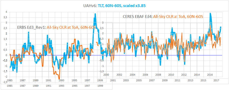
And now for the near-global (60N-60S):

Figure 21. In the 60-60 band we naturally scale down the emission flux anomaly data a bit less (/3.85) than in the tropical band, because the average tropospheric temperature gets lower the more you extend the coverage away from the equator.
The pretty tight correlation seen between tropospheric temperature and top-of-atmosphere thermal emission flux in Figs.19 and 21 definitely seems convincing in itself. However, we still do need to find independent support for the relative accuracy (and appropriateness) of our applied calibration of mean levels across the 1999-2000 gap between the ERBS and CERES datasets. Otherwise, all we’ve potentially got on our hands is a confirmation-biased curve-fitting exercise.
Based on the temp correlations in Figs.19 and 21, these are now our two merged ERBS+CERES OLR datasets (1985-2017) …
Tropical:

Figure 22.
And near-global:

Figure 23.
So what can we do to find out how good they are?
Well, we can use other available datasets quantifying that very same parameter, the total (full-spectrum) All-Sky OLR at the ToA, and which specifically and crucially span the 1999-2000 ERBS-CERES data gap, the one to calibrate mean levels across. Like NOAA’s HIRS (“High-Resolution Infrared Radiation Sounder”) record and NASA’s ISCCP FD.
We start with the latter; the so-called ISCCP FD (“International Satellite Cloud Climatology Project, Flux Data”) dataset, established under the auspices of the World Climate Research Programme (WCRP) and nominally managed by NASA GISS, a comprehensive record of calculated surface and ToA radiative fluxes. This is how the project page describes the dataset:
“The [ISCCP FD] product was created by employing the NASA GISS climate Global Circulation Model (GCM) radiative transfer code and a collection of global data sets describing the properties of the clouds and the surface every 3 hours (ISCCP); daily atmospheric profiles of temperature and humidity [NOAA’s “TIROS Operational Vertical Sounder” (TOVS)]; daily ozone abundances (Total Ozone Mapping Spectrometer); a climatology of cloud vertical layer distributions from rawinsonde [“radar wind-sonde”] humidity profiles (Wang et al., 2000); a climatology of cloud particle sizes (Han et al., 1994, 1999); a climatology of stratospheric aerosol and water vapor (Stratospheric Aerosol and Gas Experiment II); a climatology of the diurnal variations of near-surface air temperature (surface weather observations and [NCEP-1] re-analysis); a climatology of tropospheric aerosols (NASA GISS climate model); and the spectral dependence of land surface albedo and emissivity by land-cover type (NASA GISS climate model). The results include the all-sky and clear-sky, upwelling and downwelling, total shortwave (SW = 0.4–5 μm wavelength) and total longwave (LW = 5–200 μm wavelength) radiative fluxes at five levels: surface, 680 mb, 440 mb, 100 mb and top-of-atmosphere. All of these results are reported with a resolution of 3 hours and 280 km (equal-area map equivalent to 2.5 degrees latitude-longitude at the equator) in four data products: (1) TOA RadFlux, (2) Surface Radiative Fluxes (SRF RadFlux), (3) Radiative flux profiles including TOA and SRF fluxes (RadFlux Profiles), (4) the complete input data collection (RadFlux Inputs) and (5) monthly-mean flux profile (i.e., monthly average from the third product). The first three products include a summary of the most relevant input physical parameters, whereas the fourth product contains the exact inputs used to calculate all the fluxes.”
So how do our two merged ERBS+CERES OLR datasets in Figs.22 and 23 (tropical and near-global) compare with the calculated ISCCP OLR data (FD) across the five-month 1999-2000 gap?
Remarkably well, it seems. Tropics:

Figure 24. Note that the background ERBS curve (black dashed line) is Ed3, not Ed3_Rev1 (red line), which, after all, is specifically a further revision of Ed3.
And global (ISCCP)/near-global (ERBS/CERES):

Figure 25.
Next up is our second ‘control series’, HIRS. We’ll use the currently applied version, the Daily CDR v1_r2_beta3c record of HIRS-derived OLR flux data:
“Developed by NOAA and the University of Maryland, the OLR – Daily CDR data are derived from the High Resolution Infrared Radiation Sounder (HIRS) instruments on board NOAA TIROS-N series and Eumetsat MetOp polar orbiting satellites, and the legacy and present day Imager instruments on board the multinational operational geostationary satellites. This product will be extended with the new generations of operational sounding instruments on board Suomi‐NPP, JPSS, MetOp, etc., and imaging instruments on board geostationary satellites.
«The product contains the 1-degree by 1-degree daily mean outgoing longwave radiation flux at the top of the atmosphere derived from HIRS radiance observations onboard NOAA TIROS-N series and MetOp satellites. The OLR retrieval uses multispectral regression models (Ellingson et al., 1989, Lee, 2014). The CDR processing includes HIRS radiance calibration, inter-satellite HIRS OLR calibration, normalization of geostationary-based OLR retrieval to HIRS, and grid-based 7-day boxcar temporal integration assisted with Imager-based OLR derived from Gridsat CDR data (Lee, 2014).»”
How, then, does this dataset square with our merged ERBS+CERES record, specifically across that 1999-2000 data gap? Let’s have a look. As usual, the tropics first:

Figure 26. The black curve is our merged ERBS+CERES record. The red background HIRS-derived curve is from Lee, 2014. Data can be found here.
Like with the ISCCP FD overlay in Fig.24, our calibration of mean levels across the gap seems very good indeed.
What about the near global?
Well, here’s the global Daily CDR v1.2.3c OLR curve (red) from 1985 to 2012, also from Lee, 2014 (adapted, for clarity, from the original by me):

Figure 27.
First, how does it correlate with tropospheric temps? With properly scaled UAHv6 gl TLT (black) on top:

Figure 28.
It corresponds well. Except during the 1993-97 period, when the red OLR curve for some reason traces unusually low. (The ISCCP FD dataset, by the way, appears to have the same problem, as can be recognised from both Fig.24 and 25.) And as it happens, the more authoritative OLR curve, the ERBS one for the near-global (60N-60S) band, runs considerably higher through this particular interval, much more in line with the temperature data, as can also be seen in Fig.21. Our merged 60-60 ERBS-CERES OLR series superimposed on the red HIRS-based dataset in Fig.27:

Figure 29. Observe, the cross-gap ERBS-CERES level calibration here is equal to the one in Figs.21, 23 and 25.
As you can see, the ERBS data runs significantly higher than the HIRS data during the 1993-97 period. However, as we reach the 1999-2000 splice, where the ERBS data meets the CERES data (marked by the blue vertical line), the HIRS-based curve is apparently no longer sagging; we rather appear to link back up to the pre-’91 state of relative congruity.
But, yes, the overall fit is still good.
Finally we have one last independent piece of corroborating evidence verifying the legitimacy of our specific mean level calibration between the ERBS and CERES datasets. And it’s a good one. A reassuring one. Though in this particular case only involving our tropical series. It comes right from the CERES team itself – Loeb et al., 2012: “Advances in Understanding Top-of-Atmosphere Radiation Variability from Satellite Observations”. Here’s their introductory Fig.1. As you can tell, there are indeed issues of calibration between different datasets (1a). However, there are solutions (1b):

Figure 30.
Here’s what they say about the adjustment:
“(…) b with overlap correction based upon ERBS Non-scanner WFOV Edition3_Rev1 (red solid line), Nimbus-7 Non-scanner (green dashed line), ERBS Scanner (blue solid line), CERES Terra crosstrack SSF1deg-lite_Ed2.5 (blue dashed line), CERES/TRMM Scanner Edition2 (blue circle), ScaRaB/Meteor Scanner (green triangle) and ScaRaB/Resurs Scanner (green circle). Anomalies are defined with respect to the 1985–1989 period.”
They basically constrained the CERES level relative to the ERBS level using overlapping CERES/TRMM Scanner Ed2 data (1998-2000, blue circles).
How, then, does this ‘Loeb et al.’-corrected OLR record compare with my merged ERBS+CERES record (Fig.22)? Rather well, it turns out. In fact, the fit is pretty impressive, if I may say so myself:

Figure 31. Note, my ERBS anomalies are defined with respect to the 2000-2016 period, and my CERES data is the EBAF Ed4.
– SUMMARY / CONCLUSION –
Now, having more or less confirmed the validity of our two merged ERBS+CERES curves in Figs.22 and 23, and thus of the general evolution of the All-Sky LW flux at the ToA, the OLR, Earth’s final heat loss to space, over the last 32-33 years, in the tropics and near-globally, we are pretty much ready to conclude. At the start of this discussion, after having looked at NOAA/NCEI’s global OHC data covering the 1977-2017 period, we posed the following (big) question (‘The only question worth asking, really …’):
What CAUSED the opening of Earth’s positive ToA imbalance in 1988-89? And what kept (and, even today, keeps) it open?
We are now able, with confidence, to answer these two questions, and the answer is of course the same in both cases:
-
A positive feedback to warming naturally needs for warming to occur. No initial warming, no response, no loop to enter.
-
With no increase in system energy content observed over an extended period of time, the system in question can be said to be in a steady state of dynamic equilibrium between its heat input and its heat output – in the case of the Earth system, those heat inputs/outputs are the ASR and the OLR at the ToA, respectively, and a dynamic balance between them means the net ToA flux is fluctuating around zero. There occurs no warming.
-
The Earth system IS observed – in the official global OHC data – to have lingered in such a state between early 1977 and mid-1988.
-
We have high-quality observational data of ToA radiative fluxes from 1985 onwards (ERBS Ed3_Rev1, CERES EBAF Ed4), neatly covering the last 3-4 years of the 1977-88 plateau of dynamically balanced conditions within the Earth system, and the rather abrupt 1988-89 transition into an imbalanced state of net accumulation of energy and general warming.
-
OLR is observed, in these datasets, to have increased with tropospheric temps, as a direct radiative effect of those temps, all the way from 1985, its mean level today about 1 W/m2 higher than back then, both in the tropics and near-globally, corresponding to an overall rise in the mean temperature level since then of somewhere between 0.25 and 0.27 °C. (Bear in mind, now, we’re referring to mean levels here, not ENSO (or volcanic) peaks and troughs.)
-
This means that the reduction of OLR over time was never a positively contributing factor to the opening and sustainment of Earth’s positive ToA imbalance from 1988-89 onwards. Since that simply never happened …
-
So, if the Net flux at the ToA, ASR minus OLR, Qin – Qout, after having bounced around neutral in a 12-year relative lull, in 1988-89 became significantly positive and has stayed like that, in that mode, to a larger or lesser degree, ever since, based on the official OHC data, and if the OLR at the same time has grown in intensity (+Qout), this really can only mean one thing: The ASR must have grown in intensity as well (+Qin), only even more so than the OLR, thoroughly outweighing the, after all, cooling contribution of an increasing outgoing heat flux.
-
WHAT WE SEE, WHAT THE OBSERVATIONAL DATA UNEQUIVOCALLY TELLS US, IS THE FOLLOWING:
– The ASR (the solar heat input) increases significantly (starting in 1988-89).
– Temperatures (troposphere, surface, ocean) start rising as a response.
– The OLR (Earth’s heat loss to space) increases as a direct radiative effect of (mainly) – the (tropospheric) temperature rise.In short: +ASR → +T → +OLR;
………….. root cause → primary effect → secondary effect / negative feedback. -
This is what we actually SEE, folks! This is what the DATA is actually telling us! Forget about all kinds of theoretical considerations and people’s mere opinions! Science isn’t about the words of “experts”. Science isn’t about pondering and hypothesizing your way to enlightenment. Science is about OBSERVING your way to knowledge. You observe the world to know the world.
-
If you claim that ‘global warming’ since 1977 is because of us, the result of an “anthropogenically enhanced GHE”, you do not know the world. It’s that simple. All you have then is your opinion. Because there are no observations from the real Earth system that bear out your claim.
‘Global warming’ since 1977 was NOT (!!) caused by human .CO2 emissions. It was caused by the Sun.

At Twitter March, 22, Rasmus Benestad published this plot of the development of the temperature at Blindern, Norway, covering the period from 1940 up to recent:
As we can se, and as Rasmus also comments, there is a quite noticeable shift towards higher temperature at Blindern during January-March 1988.
I’m surprised he finds what happened strange, though. (BTW, he’s one year off. The actual (“strange”) switch rather occurred the following winter.)
Yes, “something” definitely happened during the winter of 1988-89. A huge (in fact, “unprecedented”) and abrupt systemic change in the dynamics of the large-scale atmospheric pressure/circulation mode over the northern half (temperate and polar regions) of the NH, going by the name of “Northern Annular Mode” (NAM) or “Arctic Oscillation” (AO), also closely related to the, perhaps more familiar, “North Atlantic Oscillation” (NAO).
AO (DJFM), 1898/99-2010/11:

AO (NDJFM), 1950/51-2015/16:

This “something”, however, is a pretty well-known phenomenon, so I find it peculiar why a person calling himself a “climate scientist”, and I believe a meteorologist by profession, would find its impact “strange” …
And the AO most assuredly affects climate in the NH. Here are a couple of nice illustrations from National Geographic (March 2000) (before they threw all objectivity out the window, and thus lost all their credibility, on everything climate) explaining how different atmospheric regimes strongly affect the inflow of warm water to the Arctic basin:


(For those interested, here’s something I wrote five years ago on this particular topic (in Norwegian), about the different (natural) factors influencing the extent/area, age and volume of NH sea ice:
http://vgd.no/samfunn/miljoe-og-klima/tema/1752792/tittel/dagens-isforhold-i-arktis )
Some old plots I did years back.
The NH equator/pole temperature gradient and its correlation with the AO:

European ‘summer’ (Apr-Sep) temps vs. ‘winter’ AO (Oct-Mar):

European ‘winter’ temps vs. ‘winter’ AO:

Thanks, Christopher 🙂
Just a pleasure 🙂
After having examined the figure Rasmus presented in more detail I fully agree with you that the real shift occurs in 1989.
What misguided me in the first place is that the first 50 days or so in 1988 are a bit warmer while the rest of the year are similar to the nearest previous years.
It was TSI, as described here. OHC responds to 1 au daily TSI, then OHC warms the air as insolation warms it.
Using TOA alone can get you lost. Did you know F10.7cm solar flux jumped from 94.4 in Dec 1987 to 199.8 in Dec 1988, when it crossed the 120sfu warming line and stayed above it all year, having one of the sharpest annual rises since 1947? TSI followed, then OHC.
If the Sun was causing global warming, the stratosphere would be warming. Instead, it is cooling — a prediction of AGW theory.
Nope. The stratosphere is cooling because of less ozone and more carbon dioxide. IN THE STRATOSPHERE. This has got nothing at all to do with what’s going on in the troposphere and at the surface.
Interesting work, but I thought Absorbed Solar Radiation (ASR) was a function of incoming solar radiation as well as albedo and reflectance. So how can you say “it’s the sun”? It might be mostly albedo and/or reflectance changes, especially cloud cover.
Also, I noticed your data do not appear to include the higher latitudes beyond 60 N and S, where there should not be much ASR, but there should still be substantial OLR. Granted the two polar regions above 60 N/S together account for only about 14 percent of the earth’s surface, but that needs to be included to get a total earth net radiation assessment. Maps I have seen of monthly global net radiation show OLR dominant on an annual basis in the polar regions (negative net radiation) and the maps include the polar regions:
https://earthobservatory.nasa.gov/GlobalMaps/view.php?d1=CERES_NETFLUX_M
oz4caster,
Regarding your first point, when I say it’s the “Sun”, I’m referring to the ASR vs. OLR balance. The reason for the warming is an increase in ASR, not a reduction in OLR. But you’re right, what caused (and is causing) the increase in ASR (the solar heat to Earth) wasn’t/isn’t an intensification of the Sun’s own activity (TSI), but rather a systematic drop in Earth’s global albedo, mainly cloud-mediated.
Regarding your second point, the only reason I’m using 60N-60S (near global) rather than 90N-90S (full global) is because that’s how far the coverage of the ERBS Ed3_Rev1 data goes. CERES, of course, covers it all, but to make this an apples-and-apples exercise, I limit even those data to the 60N-60S band.
It hardly makes a difference, however:

The CERES-II Science Team is currently updating the ERBS data to cover the entire globe (90N-90S):
“The final reprocessed WFOV data set (Ed4) is further calibrated to the absolute radiometric scale of the CERES-EBAF irradiances and the spatial coverage of ERBE/ERBS irradiances is also extended to global from near-global (60 degree N to 60 degree S latitudes) using CERES-EBAF climatological near-global to global mean irradiance ratios.”
Click to access EGU2018-10151-1.pdf
Click to access 40_Shrestha_2017.pdf
Thanks for the info. Very interesting that the full globe CERES vs 60N-60S CERES data show little difference in the OLR anomaly. The implication is that polar regions for whatever reason do not significantly affect the global OLR anomaly.
This seems pretty convincing to me. The next challenge: Why has the cloud-albedo changed?
The Radiative Greenhouse Effect Theory
Premise 1:
The earth is 33 C warmer with an atmosphere than without. (288 K – 255 K = 33 C)
So, just how does that work?
Premise 2:
There is an up/down/”back” radiative CO2/GHG energy loop between the surface and the atmosphere that “traps” and recirculates energy through QED processes warming both the atmosphere and the surface.
And what powers that energy loop?
Premise 3:
The surface radiates as a 288 K black body with an emission of 390 W/m^2 (K-T 289 K & 396 W/m^2)
Premise 1, 2 & 3 are demonstrably false.
No 33 C warmer + No up/down/”back” radiation loop + No BB radiation = Carbon dioxide and mankind play ZERO role in the behavior of the climate.
Premise 1:
http://writerbeat.com/articles/15582-To-be-33C-or-not-to-be-33C
Premise 2:
http://writerbeat.com/articles/14306-Greenhouse—We-don-t-need-no-stinkin-greenhouse-Warning-science-ahead-
Premise 3:
http://www.writerbeat.com/articles/21036-S-B-amp-GHG-amp-LWIR-amp-RGHE-amp-CAGW
https://www.linkedin.com/feed/update/urn:li:activity:6394226874976919552
Have you considered using HIRS 2.2 OLR data? I have, it shows a 3 W/m2 increase in ASR since the 1980’s. Caused by a slight decrease in planetary bond albedo.