”The main tool used in this study is correlation and regression analysis that, through least squares fitting, tends to emphasize the larger events. This seems appropriate as it is in those events that the signal is clearly larger than the noise. Moreover, the method properly weights each event (unlike many composite analyses). Although it is possible to use regression to eliminate the linear portion of the global mean temperature signal associated with ENSO, the processes that contribute regionally to the global mean differ considerably, and the linear approach likely leaves an ENSO residual. We have shown here that 0.06 °C of the warming from 1950 to 1998 can be accounted for by the increased El Niño phase of ENSO. The lag of global mean temperatures behind N3.4 is 3 months, somewhat less than found in previous studies. In part, this probably relates mostly to the key ENSO index used, as the evolution of ENSO means that greater or lesser lags arise for alternative indices that also vary across the 1976/1977 climate shift.”
From Trenberth et al. 2002: “Evolution of El Niño-Southern Oscillation and global atmospheric surface temperatures.”
I want you to bear this quote in mind – especially the highlighted part – throughout this post. Because what we will do in the following, is to address and track Trenberth’s ‘ENSO residual’, the result of ENSO-related oceanic/atmospheric processes operating and contributing regionally to global mean temps outside the ‘key ENSO index’ region in the equatorial East Pacific (the NINO3.4), and that evidently (according to the data) differ considerably in their effects (contributions) from some ENSO events to others. This extra-NINO part of the ENSO process is what caused ‘global warming’ since 1980. That’s not a claim. It’s an observation. It’s right there in the freely accessible real-world data. For all to see.
If one simply cares to have a look … And knows what to look for.
Remember that solar-heated (warm) water stored at depth, away from the surface, is not available to cause global warming from the surface up. Even if it’s ‘there’. Only once it’s brought up to and spread out over some part of the ocean surface it is. Bear this in mind also. It is key.
I owe the original inspiration, the epiphany and the knowledge behind this post mainly to Bob Tisdale. He’s the one who originally pointed out and explained my Steps 2 (the 1988 one) and 3 (the 1998 one) in the global/regional SSTa data.
(Before we move on, don’t get confused at this stage into thinking that only looking at global SSTa (the ocean’s surface temperature anomalies), not including the land portion, somehow invalidates the discovery of global temperature steps. Here is HadCRUt3gl (land+sea), upper plot, vs. HadSST2gl (the sea component (71%) of the former composite dataset), lower plot:

Figure 1.
The only real difference between these two time series, except a few wiggles here and there and the slightly larger amplitudes of the upper one (land signals), is the overall greater temperature increase from 1970 in the land+sea composite than in the SSTa-curve. Notice, however, that this extra increase (naturally deriving from the missing land portion) is still confined distinctly to our long-since identified global steps, and that there is still no further or extra rise before, between or after them. Earth’s climate is completely ruled by the ocean. Both the land mass next to and in between it and the troposphere above it simply tag along with the ocean, lagged and noisy and with exaggerated responses (a result of the much smaller heat capacity of air), but always on a tight general lead. Basically, what happens to the ocean surface, happens to the Earth’s climate at large.)
OK. Let’s begin.
I will start by reiterating the essential point I made in my last post about understanding what the ENSO process really is (once again, Tisdale is the one who originally brought these ‘news’ to the world): NINO3.4 SSTa and ‘ENSO’ is not one and the same! You cannot look solely at NINO3.4 and expect to have accounted for the full ENSO phenomenon and its total effect on global climate! The NINO index does not capture in its signal all the effects of the ENSO process. This is precisely what Trenberth’s ‘ENSO residual’ is all about. ENSO as a large-scale, coupled oceanic/atmospheric process includes more, much more, than the surface temperatures of some narrow stretch of ocean in the eastern tropics of the Pacific.
I wish that people would begin to get this into their heads. That’s really all you ever need to know: ‘ENSO’ is more than NINO3.4 (hey, it even rhymes!). Once you do, you will see at once and all by yourself (it’s almost uncannily obvious, to the point of being near-intuitive) how multidecadal ‘global warming’ (and cooling) comes completely natural. I know Tisdale has been on about this for quite some time. And still we see, on a regular basis, self-proclaimed ‘experts’ on the subject lining up to conflate NINO3.4 data with the (total and final) ‘ENSO signal’ on global temperatures. These are people that honestly should know better. Trenberth even shows us that he indeed does know better in his paper from 2002 (quote above), but still he refuses to acknowledge what that insight necessarily entails, refuses to follow the corollary of his admission to its natural end.
And this is actually, when it comes down to it, all Tisdale ever needed to do. He tracked Trenberth’s ‘ENSO residual’ in the data. And discovered that it accounts for the entire rise in global SST anomalies post 1979. And he’s been scorned and shunned as a result, his discovery actively ignored by the very people who do know better, but who refuse to face up to it. All of a sudden he’s a “denier” for simply looking into what the real-world data actually reveals about the workings of the Earth system. ‘How dares he suggest that ‘ENSO’ is more than NINO3.4?! How dares he suggest that something else than the rise in atmospheric CO2 is responsible for ‘global warming’ since the 70s?! The science is settled! Our models have given us the answer!’
Once again, NINO3.4 SSTa (red) vs. global temperatures (land+sea) (blue):

Figure 2.
Normally, as I’ve pointed out, the East Pacific signal is so powerful that it manages to override (and/or pull along) the rest of the world, clearly depicted here:

Figure 3. The SSTa of seven sectors of the global ocean when area weighted against the East Pacific (1).
Map of the regions represented in Figure 3:

Figure 4. Sector 1 includes the NINO3.4 region (black rectangle) while Sector 2 includes the WPWP and the IPWP (black ellipses). Note that the projection used makes areas towards the poles look way too large.
What we see in Figure 3 above is effectively the weighted (absolute) contributions to the global mean anomaly of each of the seven sectors pictured in Figure 4. The East Pacific signal (1) totally overwhelms all other sectors, including the West Pacific-East Indian one (2), when it comes to interannual fluctuations, but hardly makes any contribution to the overall trend, or rather, the general rise in global sea surface temperatures, from the early 80s to the 00s. (Two footnotes regarding graphs 6 and 7 in Figure 3, representing the Arctic and Southern Oceans respectively: 1) Watch how utterly insignificant those two basins are to the global mean temperature evolution, and 2) also observe (you’ll see it if you squint) how they practically negate each other’s trend (the Arctic Ocean warming, the Southern Ocean cooling).)
So for most of the time, NINO3.4 (representing the East Pacific) actually does act as a good proxy for the total ENSO signal. Simply because it’s so powerful. Since 1970, it’s actually been like that for 41 out of 44 years. That’s 93% of the time. Not quite as good of course as the certainty (without any basis in science, as a matter of fact, without any real-world empirical evidence whatsoever to back it up) of the IPCC in their ‘Fifth Assessment Report’ that our CO2 emissions is what caused the majority of ‘global warming’ over the same period. But, still pretty impressive.
Global temperatures only diverge permanently from NINO3.4 at three specific instances during all those years (Figure 2), by lifting abruptly away from it inside the span of a year. It happened in 1979, in 1988 and in 1998. It stands out, plain as day, in the data. There’s no denying it. It’s there. Right in front of us all.
We’ve already accounted for the 1979 global step (Step 1). It occurred as a direct result of the PDO (PDV) phase shift from a ‘negative’ (cool) to a ‘positive’ (warm) regime in 1976/77, as the East Pacific experienced a significant wholesale surface warming while the West Pacific did not similarly cool to offset that warming (“How the world really warmed …, Part II: Step 1″).
This first step, then, wasn’t really an ENSO-induced step. Rather, the climate shift causing it also and at the same time caused a fundamental change to the ENSO process itself. It set the stage for what was to come …
We’re left with Steps 2 and 3 in Figure 2, both so to say taken inside the new and ‘warm-favouring’ climate regime of the Pacific established with the 1976/77 shift.
In 1988 and 1998 global temperatures once again diverge suddenly and permanently from NINO3.4 (Figure 2). Something happened outside the NINO3.4 region at these two specific times that massively affected global mean temperatures, but which was thus specifically never captured by that ‘key ENSO index’. This ‘something’ must have been so out of the ordinary as to disrupt the world’s normal linear response to the East Pacific signal. And we shall see that this ‘something’ is still very much ENSO-related. We see it in the data. We can track it. We can see when it happened and where it happened. It’s only silly to try and deny it. Steps 2 and 3 were created in the exact same way. By the same processes. Bob Tisdale has already shown us what happened and how it happened thoroughly on his website, but I will provide my own summary here.
Basically, when we look at how the change in global sea surface temperatures over the last 30+ years has evolved, we see immediately that it’s far from being evenly distributed across the global ocean. In fact, a couple of regions really stand out:

Figure 5. (Map created by and borrowed from Bob Tisdale.)
The two regions in question are the West Pacific and the North Atlantic (note that the map projection in Figure 5 progressively overscales areas away from the equator; the North Atlantic in reality only covers about 12% of the global ocean.
What’s interesting with the West Pacific and the North Atlantic is how integrated a part of the larger coupled oceanic/atmospheric ENSO process they both are, the former directly (oceanically) linked, the latter indirectly (atmospherically) so. The West Pacific responds without a lag, but in an inverse manner, to what happens in the East Pacific (in fact, one shouldn’t really call it ‘responding’ at all; the two ENSO basins rather make up the opposite ends of the same ongoing pendulum process). The North Atlantic responds (and here it is proper to call it just that) in a direct manner, only with a considerable lag, to what happens in the East Pacific … most of the time.

Figure 6. Top chart: North Atlantic SSTa (blue curve) directly synchronised with the ‘Warm West Pacific Horseshoe’ (WWPH), corresponding to the striking ‘Pac-Man’-like shape seen in Figure 5; WPWP+KOE+SPCZ (yellow curve). Central chart: North Atlantic (blue) vs. scaled and lagged (by 7 months) NINO3.4 (red). Bottom chart: WWPH (yellow) vs. scaled NINO3.4 (red).
Note how in Figure 6 the direct North Atlantic SSTa response to the East Pacific signal is considerably lagged, but because the West Pacific is inversely related to the East, the North Atlantic El Niño peak is still reached on average a few months before the following West Pacific La Niña peak. So the two curves appear to correspond directly, with the North Atlantic leading, but in reality they do not correspond directly at all; their connection goes through the East Pacific, one inversely related, the other one lagged.
Let’s have a look at the West Pacific first.
I’ll use NINO3.4 as a proxy for the East Pacific, since it’s a cleaner and more directly operative signal. (Also, we know from the previous post that NINO3.4 and the ‘Real’ East Pacific follow a near identical course since 1979/80.)
NINO3.4 scaled and INVERTED against ENSO West:

Figure 7.
Bear in mind that this (the green curve) represents the SSTa evolution of the red (western) slice of the ‘ENSO map’ from the last post in its entirety, from 1970 till today. The NINO3.4 curve (representing ENSO East, the blue slice) is simply flipped around to show how well-established the inverse relationship between the two ENSO sectors really is. First of all, you will notice how the ENSO West (West Pacific + East Indian Ocean) SSTa curve does not deviate from the upside-down NINO3.4 curve across the 1976/77 climate shift. There is no step here. Either up or down. This shift was a purely East Pacific (extra-NINO) SSTa shift. We have to move all the way down to the year 1988 (sounds familiar?) to see something of interest occurring. Here is how it all proceeds from there:
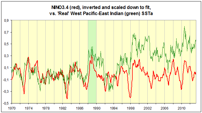
Animation 1.
The SSTa in ‘Real’ ENSO West (green curve) starts rising prodigiously during and after the peak of the 1987/88 El Niño, as it abruptly transitions into the powerful 1988/89 La Niña, quite prominently bursting the confines of the tight correlation that prevailed during the preceding 17-18 years, the green curve practically shooting up beyond the inverted red NINO3.4 curve. What’s just as remarkable is how the western SSTa stays elevated during the ensuing two to three years of slow transitioning through neutral ENSO territory between the deep La Niña (88/89) and the next El Niño (91/92). (In between, Pinatubo strikes (June ’91).)
The exact same thing then happens in 1997/98 and down toward the 2002/03 El Niño: The green western SSTa curve suddenly towers up above the NINO3.4 curve and refuses to settle back down. And in 2010 it happens yet again; the ENSO settings here are pretty much exactly the same as on the two previous occasions*, but this time around the resulting rise is much more moderate – the whole process seems to have lost its ‘oomph’. In fact, if one consults the more regional data, one will see that this final small rise is actually solely derived from the East Indian part of ‘Real’ ENSO West, not at all from the West Pacific part (compare the end of the green curve (‘Real’ ENSO West) in Figure 7 with the yellow curve (WWPH) in Figure 6).
*I have mentioned earlier the characteristic and repeating ENSO sequence that started rolling in 1970, and, as it seems, still rolls on to this day. This is it:

Figure 8.
From 1970 till today we’ve had four rounds of great solitary El Niños preceded and succeeded directly by prominent La Niñas, most of the time multiple-year ones which thus notably always timewise comfortably outdo the central El Niño. In between these striking periods of major back-to-back events there are extended stretches without real La Niña conditions, with the ENSO state mostly fluctuating between neutral and warm, the swings being on average much smaller than in the distinct ‘Niña-Niño-Niña’ segments. There are significant El Niños also within these more ‘muted’ sections of the ENSO sequence, but they are never ‘solitary’ like the 1972/73, the 1986-88, the 1997/98 and the 2009/10 events. And we notice in the data how their impact on global mean temperatures is consequently much harder to spot, in fact many times it’s all but nonexistent.
Basically, the ENSO events contained within the four green ellipses in Figure 8 above are Trenberth’s ‘larger events’ since 1970, whose signal rises above the regional noise of the rest of the world, effectively drowning it and leading global temps by on average three months.
According to most comprehensive data analyses of OHC (Ocean Heat Content), the bulk of the global ocean started warming (experienced a net accumulation of energy) in 1970, just as this characteristic ENSO sequence started rolling. The general rise in global OHC since then is therefore clearly connected to these four great La Niña-periods, split only by brief, but very strong El Niños in between. This is fairly easy to show from the available OHC data. You need only divide the global ocean into two oppositely fluctuating (pendulum) ‘basins’, the one swinging with the WPWP and the other swinging with NINO, the two inversely related sectors of the ENSO process. The picture, then, becomes very clear. But this is a subject we won’t get into in this particular series of posts. We’re only interested here in the modern ‘global warming’ from surface up. OHC, most interesting in its own right, is for later … One thing at a time.
Another way of showing how the events of 1988 and 1998 were each something quite out of the ordinary, is noticing how they both produced momentous shifts in the Pacific oceanic/atmospheric ground state, seen only at these instances. Such regime shifts occurring in 1988/89 and in 1998/99 have been documented and discussed in several studies. What’s most interesting about these shifts is how they mark the end of dominance of the PDO SSTa pattern in the North Pacific (a position it had held on to probably all the way since 1924/25). The 1988/89 and 1998/99 Pacific regime shifts were specifically not PDO shifts like the one in 1976/77. While the PDO pattern shifts with changes in the ENSO state and the Aleutian Low (AL), these two shifts rather affected another and up until 1988 secondary North Pacific SSTa pattern which has been associated with the so-called NPG, the North Pacific Gyre, which also seems to change in its ground state between regimes in something termed the NPGO, the North Pacific Gyre Oscillation, directly associated with its atmospheric (pressure-based) counterpart, the NPO (North Pacific Oscillation). This second mode of North Pacific SST anomaly distribution has been dubbed ‘The Victoria Pattern’ (to learn more about it, google it):

Figure 9. The PDO (EOF1) and the Victoria (EOF2) SSTa patterns of the North Pacific + their index fluctuations between 1950 and 2003. From Bond et al. 2003: “Recent shifts in the state of the North Pacific.”
As always, the South Pacific is much less well-studied than the North Pacific, but there are reasons to believe once more that there were similar shifts occurring at the same approximate times south of the equator in the Pacific basin, mostly deduced from the fact that the general temperature anomaly evolution of the SPCZ between 1980 and today more or less matches that of the KOE exactly.
We know now that something happened in the West Pacific during the transition from the great El Niños of 1987/88 and 1997/98 to the severe La Niñas directly on their heels that raised mean SST anomalies here way beyond the bounds of the preceding regimes. What happened was simply this: The warm water surface area of the WPWP expanded and the KOE and the SPCZ received extraordinary amounts of warmer-than-normal water to be spread out over huge surface areas in the sub and extratropics:
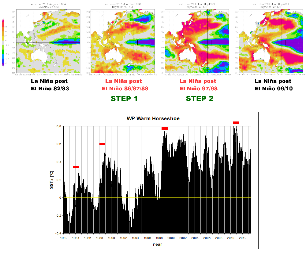
Figure 10. Using a 1982-87 baseline for the SSTa in the vast West/Central Pacific + East Indian region of the global ocean, two ‘steps’ in the West Pacific mean level temperature anomaly are identified. It can clearly be seen how the WPWP+KOE+SPCZ (‘Warm West Pacific Horseshoe,’ WWPH) flares up during the 1988/89 La Niña (second upper panel from left) as compared to the similar period post the 1982/83 El Niño (first panel), and how it happens again during the 1998/99 La Niña (third panel) as compared to the 1988/89 La Niña. These first three panels correspond to the three first red hyphen-like markers in the chart below (representing the SSTa evolution in the WWPH region between 1982 and 2013, equal to the yellow curve in Figure 6). The fourth panel depicts the SSTa distribution during the 2010/11 La Niña. Observe how it tries once more to take a step, but can’t really outdo the previous peak of the 1998/99 La Niña. So no real Step 3 observed, at best it appears to be a decent attempt. The upward shifts of mean level West Pacific SSTa post 1988 and 1998, however, are both unequivocal. (Beware the deep gouge in the black WWPH graph between roughly 1991 and 1995, coinciding with and significantly deepened by the impact of the June ’91 Pinatubo eruption.)
(So why didn’t the events following the clearly enormous El Niño of 1982/83 lift the mean surface temp anomalies of the West Pacific in a similar fashion as the two succeeding ones. In my opinion, there are two main reasons: 1) There was no preceding La Niña to accumulate West Pacific OHC, consequently, as the El Niño drew its warm water up and spread it out across the surface of the East Pacific, it depleted the WPWP to such an extent that it could only be restored with the subsequent La Niña, not grow. This is evident from the OHC data. Basically, the El Niño of 1982/83 was a freak occurrence. It shouldn’t really have happened. At least not end up as super-strong as it did. 2) The subsequent La Niña wasn’t really a proper La Niña at all to begin with, meaning, it never went really deep within the first season of the waning El Niño, and also lost power again pretty quickly, as opposed to the 1988/89, the 1998/99 and the 2010/11 La Niñas. In the end, it turned out to function rather as the build-up event to the 1986-88 El Niño.)
Where did all this ‘extra’ warm water come from in 1988 and 1998? There are two obvious sources:
- Leftover warm water from the dying El Niño.
- Freshly generated warm water from the growing La Niña.
From studying the data, we can see how at some point before the peak of the El Niño, the static (one could almost call it ‘paralysed’ or ‘lethargic’) atmospheric state in the enormous central Pacific broke up, westward winds across the tropical basin picked up again and within just a few months, normal circulation was reestablished. But at this point, huge expanses of warmer-than-normal El Niño water still remained at or near the surface in the East. It never had the time to dissipate before the pendulum turned. And now it got pushed back by the trades to where it was originally drawn from, the WPWP, but also floating back west outside the tropical zone via massive so-called oceanic Rossby waves.
These El Niño remnants provided the original pulse of ‘extra’ warm water back to the West (the ‘shooting up’-part of the green ‘Real’ ENSO West curve in Figure 7), but the following La Niña is what kept the SSTa elevated, feeding it as it normally does with fresh solar-heated water from the eastern and central Pacific tropics:
- The first La Niña, the one preceding the El Niño, accumulated the original fund of solar-heated warm water in the WPWP, to be used as ‘fuel’ by the coming El Niño, mostly away from the surface, stored significantly at depth.
- Then the El Niño pulled this warm water up and out and spread it across the surface to create ‘global warming’.
- But the El Niño was too strong and too brief. It could not get rid of all its retrieved warm water in time before its eventual demise. Much remained on the surface in the East.
- This leftover warm water thus came on top of, in addition to, the ‘new’ warm water now being generated, taken to the West and stored up during the second La Niña, directly on the heels of the El Niño, expanding the WPWP.
- Moreover, the eastern leftover warm water being brought back West outside the central tropical conveyor belt, also to a large extent ended up on the surface, because there is no deep-water storage going on in the KOE and the SPCZ as there is in the WPWP, so here it more readily buoys up.
- All this extra-ordinary piling up of warm water on the surface of the West Pacific, then, helped to counter the eastern La Niña cooling much more effectively than usual. We see this plainly in the all-Pacific data, resembling very much the global.
This naturally brings us to the North Atlantic. Because this distinct course of events in the Pacific also ended up greatly affecting the SSTa evolution of the North Atlantic basin, being strongly influenced by what happens in the Pacific.
NINO3.4 scaled and LAGGED against the North Atlantic:

Figure 11.
Note that these two curves are superposed (NINO lag included) from 1964 onwards. What do we see? There is no North Atlantic step up relative to NINO3.4 post 1976/77 either. The North Atlantic SST anomalies dutifully follow in the footsteps of the NINO3.4 (tropical East Pacific), all the way down to … 1988 yet again (looks like 1989 here, but that’s because of the 7 month NINO lag). At that point in time something big all of a sudden occurs. And it takes place more times than one; in 1998 and (an attempt) in 2010 as well:

Animation 2.
So what exactly happens in the North Atlantic? It normally owes its general SSTa progression to what happens in the tropical East Pacific (NINO3.4), warming (and cooling) the following season (NINO peaks around December/January, North Atlantic (Warm Pool) peaks around June/July). But not always. There is a lot of Atlantic noise, especially and specifically outside the big ENSO events. Remember what Trenberth pointed out (top quote): “(…) it is in [the larger] events that the signal is clearly larger than the noise.” The Atlantic noise doesn’t really matter much to the overall SSTa evolution, though. It’s clear from the data (above), after all, that the decadal trend of the North Atlantic is not free to stray from the East Pacific one.
No, when the North Atlantic does in fact deviate from the East Pacific, it does so in very distinct and massive steps, in sudden instances of surface heat accumulation defying the clear calls for cooling from the East Pacific lead (Figure 11, Animation 2).
So how come the North Atlantic refuses to cool proportionally along with the East Pacific during the 1988/89, the 1998/99 and also the 2010/11 La Niñas?
Go back and study once more the three graphs in Figure 6.
Here’s the nub of the matter: Just as the peak of the North Atlantic El Niño response is dropping and about to cool with the East Pacific La Niña, the West Pacific rears a massive sub/extratropical warming signal, much stronger and more persistent than usual, greatly perturbing the atmosphere above it. How does this affect the normal cooling process in the North Atlantic? Watch how the KOE compels the mid-latidude anomalies of the North Atlantic to covary with the mid-latitude North Pacific (via atmospheric bridges moving west-east within the Ferrel cell) during and after El Niño 1997/98 (Animation 3, below); the normal North Atlantic discharge of ‘El Niño heat’ simply appears to be hampered by the sustained abnormal warming of the extratropics, induced by the mid-latitude change in atmospheric state come the La Niña:

Animation 3.
Watch first the delayed North Atlantic warming response to the great El Niño. As per our current knowledge, it comes about like this (Wang (NOAA) 2005: “ENSO, Atlantic climate variability, and the Walker and Hadley circulations”):
“The Walker and Hadley circulations can serve as a “tropospheric bridge” for transferring the Pacific El Niño SST anomalies to the Atlantic sector and inducing the TNA [Tropical North Atlantic] SST anomalies just at the time of year when the warm pool is developing. As the Pacific El Niño warming culminates near the end of the calendar year, an alteration of the low latitude direct circulation occurs, featuring (1) an anomalous weakening of the convection over northern South America, (2) Walker circulation anomalies along the equatorial strip to the east and west, and (3) a weakened northward Hadley flow aloft. The Hadley weakening results in less subsidence over the subtropical North Atlantic, an associated breakdown of the anticyclone, and a weakening of the NE trades in the TNA.”
But observe then, as the quickly ensuing La Niña is establishing itself firmly in the East Pacific, how the normal Atlantic response to this appears never to gain a proper foothold; as it seems, likely because of the simultaneous mid-latitude atmospheric response to what happens in the West Pacific (the KOE).
The general circulation patterns in the Pacific and Atlantic Oceans:

Figure 12. Global SSTa situation in the boreal spring of 2011. I’ve highlighted the grand-scale patterns of anomalies (straight black lines) going from the Pacific to the Atlantic via the troposphere, the pressure cells (Highs and Lows) and the corresponding circulation systems (red arrows).
Watch how there is substantial general movement of (warm, tropical) air and water from the South Atlantic across the equator to the North Atlantic basin. This is something we don’t see in the Pacific. It’s a result of the difference in configuration of the continents surrounding the two oceans. The warm pool naturally collecting towards the western edge of the Pacific basin straddles the equator, while the equivalent warm pool in the Atlantic basin is shifted way to the north, centred on the Caribbean and the Gulf of Mexico and consequently fluctuating much more with the seasons (refer to the Wang quote above). There is no warm pool in the South Atlantic. Also observe how, for the same general reason, the mean transport of water, air and thus energy in the wide Pacific basin is zonal (east <-> west), while in the more narrow North Atlantic basin it is meridional (south <-> north).
This post has gotten long enough at this point.
I urge you not primarily to focus on what I’ve been saying about mechanisms and processes behind Steps 2 and 3, the explanations given for them, in this post, but to rather focus mainly on the actual global and regional data I’ve presented. It itself should suffice. By all means, look at it – its varying amplitudes, its spatial distribution and its timing – and make up your own mind. How would you explain global Steps 2 (1988) and 3 (1998)?
I will sum up the three steps of ‘modern global warming’ in my next post. I will, however, round off with a brief summary already here, of Steps 2 and 3:

Figure 13. ‘Real’ ENSO West vs. ‘Real’ ENSO East.
Have a look at the two trend lines in Figure 13 starting around 1979/80. ‘Real’ ENSO East has generally cooled since this time, while ‘Real’ ENSO West has warmed, quite in accordance with the inverse relationship between the two basins. What you will notice, however, is that West has warmed considerably more than East has cooled (the data behind the two curves are area weighted against each other, so are directly comparable in a ‘global contributional’ sense). We know now that this results specifically from the excessive and swiftly unfolding ‘response’ of western SST anomalies (primarily confined to the WWPH: WPWP+KOE+SPCZ) to two distinct, major El Niño/La Niña transitions taking place in 1988 and 1998 respectively.
Recall how Step 1 came as a result of an East Pacific surface warming not countered by a proportional West Pacific cooling. Steps 2 and 3 were likewise caused by instances of West Pacific surface warming prominently outdoing the corresponding East Pacific cooling. The North Atlantic (and the Indian Ocean) in turn added to (and resulted from) these two instances of West Pacific warming.
In other words: Step 1 was an East Pacific step. Steps 2 and 3 were West Pacific steps.
The physics behind this multidecadal warming (and the equivalent cooling) process is really very simple and basic. There’s nothing novel or mysterious (or “anti-scientific”) about it: Solar energy input to the global ocean (cloud variation) and subsequent oceanic/atmospheric (temporal and spatial) distribution of this energy to the world (pressure/wind variation). La Niña takes up solar energy, El Niño releases it back out. There’s an inherent ‘give-and-take’ kind of balance to this process that will necessarily always struggle to remain symmetrical over certain time intervals – in reality, it can never be, and never is (in the short and medium terms).
The ocean rather fluctuates Earth’s climate around a solar mean: warming, cooling, warming, cooling.
And there you have it …

Tusen takk for disse artiklene, det er en fryd å lese dem. Ventetiden mellom hver artikkel er lang og kjedelig, dette er nesten som å se en spennende TV-serie der man ikke vet når neste episode kommer!
Hei, Pål. Hyggelig med tilbakemelding. Foreløpig (?) fungerer jo dette mest som en referanse-blogg for meg selv. Og nå i ferien går jo ting litt tregt og i rykk og napp. Vil ikke garantere at det blir mer flyt når jobben begynner igjen, men …