In IPCC’s Fifth Assessment Report (AR5) of last year, they stated the following:
“It is extremely likely [95 percent confidence] more than half of the observed increase in global average surface temperature from 1951 to 2010 was caused by the anthropogenic increase in greenhouse gas concentrations and other anthropogenic forcings together.”
‘More than half.’ That sounds like a pretty conservative guess. Well, they end up going further than that. Much further.
What caused global warming over the last 60 years or so, according to the IPCC? Apparently, human ‘greenhouse gas’ emissions alone (100%):
“The best estimate of the human-induced contribution to warming is similar to the observed warming over this period … The observed warming since 1951 can be attributed to the different natural and anthropogenic drivers and their contributions can now be quantified. Greenhouse gases contributed a global mean surface warming likely to be in the range of 0.5°C to 1.3 °C over the period 1951−2010, with the contributions from other anthropogenic forcings, including the cooling effect of aerosols, likely to be in the range of −0.6°C to 0.1°C.”
That should be a net range of anthropogenic ‘contributions’ to the general global temperature rise between 1951 and 2010 of 0.6 to 0.7°C.
So, then, what did not contribute at all (0%) to that same general warming, according to the IPCC? Apparently, natural external factors like solar activity, and natural internal factors like ocean cycles:
“The contribution from natural forcings is likely to be in the range of −0.1°C to 0.1°C, and from internal variability is likely to be in the range of −0.1°C to 0.1°C.”
That should make up a total natural contribution to the general global temperature rise between 1951 and 2010 of exactly 0°C.
So how much warmer on average – again according to the IPCC (HadCRUt4) – are we today than we were 60+ years ago?

Figure 1.
I would say a tad more than 0.6 degrees.
Gee. Doesn’t that fit very neatly with the attribution assessment above? Pretty much right on the mark, I would say. What swell and clever guys, those IPCC scientists …!
Well, as it turns out, this claim (100% human, 0% natural) is either a flat-out lie, or a show of complete and utter incompetence. You decide for yourself.
Here’s the story told by the actual observational data from the real world.
Over the last 60+ years, global mean temperatures only saw a general rise inside the 25-year time segment starting with 1977 and ending with 2001 (Figure 1). And even inside this period, it’s quite evident from the graph above just how the temperatures rose. They did so in three sudden and significant steps ONLY.
‘Global warming’ from 1951 to 2010 (and 2014) only occurred in three abrupt upward shifts. The entire global temperature rise over the last 60+ years is confined to those three brief instances of substantial warming.
How do you explain this remarkably conspicuous and characteristic progression with IPCC’s ‘anthropogenic contributions’? First nothing (in fact, cooling) for the first 25 years. Then a sudden shift up. Then nothing again the following decade. Then another jump. New decade without anything happening. Third substantial hike. Finally nothing once more for the remaing 15 years or so. No hint of any gradual decadal warming – as if from some posited increasing ‘radiative forcing’ – anywhere over the last 40, 50 or 60 years. ONLY those three distinct, sudden warming steps, each occurring within a year.
You don’t. You can’t. You can try, but it will be no more than conjectures upon conjectures. No observational support of any kind.
So what about natural factors? Those ‘nonexistent’ ocean cycles, for instance.
NINO3.4 (red) vs. global temps (HadCRUt3, blue):

Figure 2.
NINO3.4 leads global temperatures consistently throughout the period. The main ups and downs on the global curve are clearly the ENSO East signal. Only on three occasions does the global curve separate on a permanent basis from the NINO3.4 curve. The three global steps are thereby identified and pinpointed. They occurred relative to NINO3.4, in 1979, in 1988 and in 1998 respectively. At all other times, the global simply dutifully tracks the general course of the East Tropical Pacific.
All that needs to be explained, then, is what happened outside the NINO3.4 region during those three years? Where did this extra ‘surface heat’ come from?
The data tells the story.
In 1979 it spread out across the East Pacific as a consequence of the SO* >> PDV** regime shift in 1976/77.
*Southern Oscillation; **Pacific Decadal Variability
In 1988 and 1998 it spread out across the West Pacific (and the North Atlantic) as a result of the transition between strong, solitary El Niños and the directly succeeding strong La Niñas, within the ‘warm’ Pacific climate regime established in 1976/77.
In other words, in 1979 the surface of the East Pacific warmed abnormally outside the equatorial NINO3.4 region and thus raised the global mean up and above the NINO lead, after the regular El Niño/La Niña sequence of 1976-78. In 1988 and 1998 the same thing happened, only this time it was the surface of the West Pacific (and, consequently, through atmospheric teleconnections, also the North Atlantic) that warmed abnormally, defying the NINO (East Pacific) calls for La Niña cooling.
We see these regional warmings clearly in the data. We can observe exactly when and where they happened at each step. And their tight connection to the larger ENSO process is obvious once you know just a little bit about how it works.
A visual rundown:
With Figure 2 (above) as our starting point, here is how the three global steps relative to NINO3.4 (ENSO East) came to be.
First Step 1, 1979:

Figure 3. The mean east-west pressure gradient across the wide tropical Pacific basin (represented by the SOI (SO Index)) dropped abruptly and significantly in 1976/77 (and stayed low for the next three decades), relaxing somewhat the wind-driven process of pushing solar-heated water from the East to the West Pacific. This resulted in a general surface warming in the East, but no equivalent surface cooling in the West, where most of the warm water is stored rather at depth, making the surface response to an increase/decrease in warm-water input much smaller. Simply put: More of the solar-heated water ended up at the surface after 1977 than before 1976.

Figure 4. The relative warming of the East Pacific outside the NINO3.4 region (black rectangle) following the 1976/77 drop in SOI, leading to the establishment of the classic warm-phase PDO (PDV) SSTa pattern. The change pictured above is plotted below:
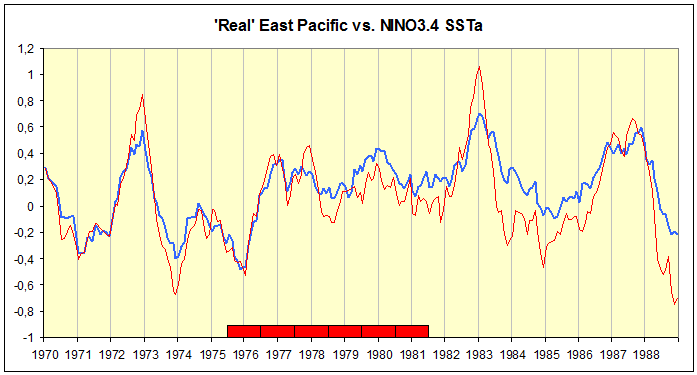
Figure 5. East Pacific, blue. NINO3.4, red. The six red rectangles on the x-axis cover the same years as the six maps in Figure 4.
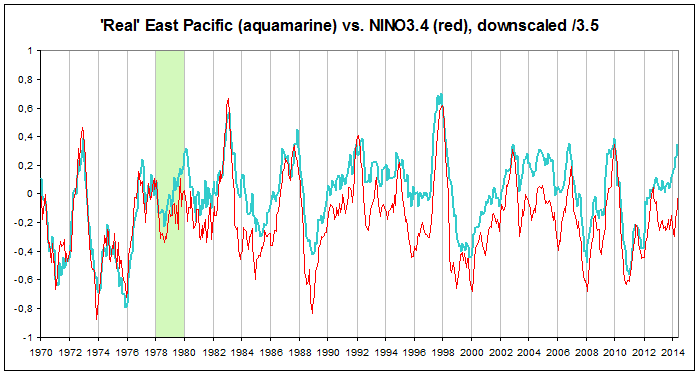
Animation 1. As you can see, the relatively sudden lift in East Pacific SSTa above the NINO3.4 taking place between 1978 and 1980 is a unique occurrence in the relationship between the two over the 44-year period since 1970. The East Pacific as a whole warmed relative to NINO3.4 and has stayed equally elevated to this day.

Figure 6. Global followed East Pacific SSTa across the 1979 shift. Hence, there are only two global steps relative to the East Pacific since 1970, one in 1988 and one in 1998.
Steps 2 and 3, 1988 and 1998:
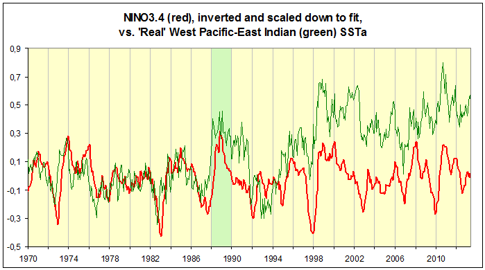 Animation 2. The West Pacific is inversely related to the East Pacific. That’s because the ENSO process, operating across both basins, works like a pendulum. When East is cool, West is warm. And when East is warm, West is cool. NINO3.4, representing the East, is hence turned on its head to correlate directly with the West. Since 1970, we observe two distinct steps in western SSTa up and away from the otherwise tight NINO3.4 relationship, one in 1988 and one in 1998. Both warmings happened as strong, solitary El Niños peaked and swiftly transitioned into the following strong La Niñas. (Note how there is no step in the West, neither up nor down, during the 1978-80 East Pacific warming.)

Animation 3. What happens in the Pacific strongly affects the North Atlantic, not just in the tropics, but also in the extratropics, through so-called atmospheric bridges. Watch how the general anomaly pattern of the extratropical North Pacific teleconnects to the extratropical North Atlantic (from the start of 1997 to the end of 2001).

Animation 4. The North Atlantic responds directly to what happens in the tropical East Pacific with a considerable lag (from boreal winter to boral summer). Since 1964, we notice two occasions where North Atlantic SST anomalies move up and away from the otherwise tight lagged relationship with NINO3.4 (representing the tropical East Pacific). In 1988 and 1998 (green ellipses), the North Atlantic simply doesn’t cool as much as the East Pacific lead would have it. This markedly restrained cooling coincides with the burgeoning and expansive surface warming in the West Pacific sub and extratropics of those very years. (Note how there is no permanent step up relative to NINO3.4 in the North Atlantic during the 1978-80 East Pacific warming.)

Figure 7. INVERSE RELATION. WWPH, yellow. NINO3.4, red. Watch the stronger-than-usual western warming in 1988 and 1998. Here is where it’s centred:
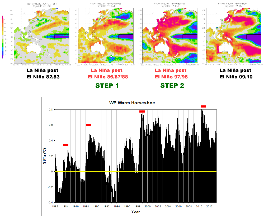
Figure 8.

Figure 9. LAGGED RELATION. NA, blue. NINO3.4, red. The North Atlantic SSTa didn’t drop with the East Pacific La Niñas of 1988/89 and 1998/99, just at the times when the West Pacific warming (Figures 7 and 8) occurred:

Summary graph:

The recipe for multidecadal ocean cycle warming/cooling is really quite a simple one:
The tropical oceans always soak up enormous amounts of solar energy. Much of this they send out to the extratropics. But this distributional process is not a static or unchanging one. It is a highly dynamic one. How much is kept at depth? How much and how wide is it spread out across the surface? How efficiently is it transferred into the troposphere? How much is kept in the tropics and how much reaches the Arctic/Antarctic?
All of this varies. Pressure systems are not constant on top of the global ocean surface. Not in strength, not in gradient, not in location. Pressure gradients strongly affect winds across the ocean. Winds strongly affect evaporation rates from the ocean surface. Both winds and evaporation rates strongly affect cloud cover over the ocean. Pressure gradients also affect the strength and the course of the jet streams, in turn affecting general atmospheric circulation, weather patterns and perhaps particularly cloud cover distribution.
The ENSO sequence running at multidecadal timescales to a large extent determines how much solar energy (‘heat’) is being absorbed and emitted by the Earth system. People are blinded by the flat trend of the NINO3.4. They don’t understand the dynamics behind and around it. The relative succession of La Niñas, El Niños and transitional/normal periods significantly affects the energy budget of the Earth system. Simply stated, if there are two years of La Niña (net storage), then one year of El Niño (net release), then another three years of La Niña (net storage again), then the total system energy content over that period will have naturally increased substantially. There exists no short or medium term ‘symmetry clause’ for this dynamic process. There has been no such symmetry since 1970.
And as a result, you get NATURAL MULTIDECADAL GLOBAL WARMING.
The Pacific Ocean did it.
For details on all this, read “How the world really warmed … Parts I, II and III“.
