Two renditions of global surface (land+ocean) temperature anomaly evolution since 1970:

Figure 1.
The upper red curve represents the final 46 years of the temperature record most frequently presented to (and therefore most often seen by) the general public: NASA’s official “GISTEMP LOTI global mean” product. There is hardly any “pause” in ‘global warming’ post 1997 to be spotted in this particular time series. It is the one predictably trotted out whenever an AGW ‘doom and gloom’ activist sees the need to ‘prove’ to a sceptic that “global warming” indeed continues unabatedly and rub his face in it.
The lower curve in Fig. 1 is an altogether unofficial one. However, it should still be fairly familiar to most. It is the one having been consistently used by me on this blog to represent actual global surface temperature anomalies since ~1970. It is time to explain (and to show) why …
This particular curve is simply the now defunct UEA/UKMO land+ocean product “HadCRUt3 gl” with an en bloc downward adjustment of 0.064 degrees included from January 1998*. The “Pause” is here vividly seen as but one (albeit an extended one) of several plateaus in an upward, distinctly steplike progression of global temps since the 70s.
* I discussed here why this is a necessary adjustment.
Now, which one of these two renditions is more honest in its attempt to depict the actual “reality” of things? And which one is the result of simply inventing extra warming?
Let’s have a look.
The following analysis uses data acquired from KNMI Climate Explorer and WfT.
I will draw your attention to a remarkable circumstance. If you, rather than using GISTEMP’s official (and I would almost dare say ‘iconic’) “global mean” displayed in Fig. 1 (90N-90S, 1200 km smoothing, base period 1951-80), were to compare the corrected HadCRUt3 gl curve (that is, the one appropriately adjusted down 0.064 degrees post 1997 in Fig. 1) with a narrower version of the global GISTEMP LOTI (“Land Ocean Temperature Index”) product, one spanning from 60N to 60S only and with a smoothing radius restricted to 250 km, while employing a base period equal to that of HadCRUt3 (1961-90), the two sets would all of a sudden line up like this:

Figure 2.
Ok, you might think. How does the restricted 250 km smoothing technique inside the 60N-60S band affect the end result here? Doesn’t it leave open large ‘gray’ areas that tend to skew the total, much like with the HadCRUt products? And isn’t carefully considered methods of interpolation (as applied by GISS in smoothing out to 1200 km) a good way of dealing with this? Well, perhaps. Perhaps not. It turns out, though, that it doesn’t in fact make much of a difference either way:

Figure 3.
As you can see, there is practically no difference between employing a 1200 and a 250 km smoothing technique inside the broad 60N-60S latitudinal band. There appears to be absolutely no divergence of any significance internally within two particular segments of the graph in Fig. 3, the first one spanning from 1970 to 1993 and the second one from 1994 to now, but a tiny, tiny step across the 1993-94 transition between them. Most importantly, though, going from 250 to 1200 km smoothing won’t impact GISTEMP’s obvious 60N-60S 1997-2014 “Pause” one bit.
And with this knowledge we return to striking Fig. 2. What is so remarkable about it?
Simply the tight correlation between the two curves. The fact that it so neatly justifies the downward adjustment of the HadCRUt3 series post 1997. The fact that the “Pause” so readily manifests itself in the GISTEMP 60-60 graph, basically tracking the lower curve in Fig. 1 rather than the upper.
Which means the entire difference between the two time series plotted in Fig. 1 somehow originates outside the 60-60 band.
Which is indeed peculiar …
How so? you might ask.
Because going from 60-60 to 90-90 normally doesn’t introduce any significant changes at all to the total when investigating most climate parameters. And this is actually fairly common knowledge. (Even the central 40N-40S band would in most cases provide a near perfect representation of a full global perspective, the only real difference being the size of interannual amplitudes (larger the more you focus in on the tropics).) As you can readily observe in Figures 4 and 5 below, neither the lower troposphere nor the world ocean experience any steepening in their temperature anomaly trend when extending the area coverage from 60N-60S to full global:
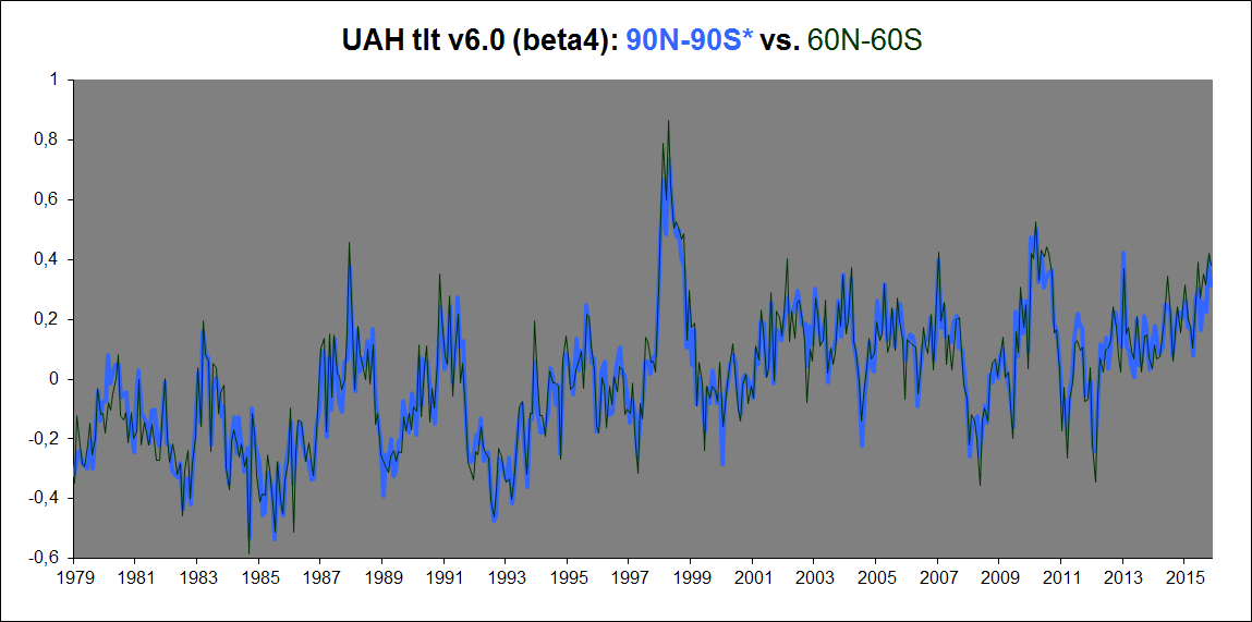
Figure 4.
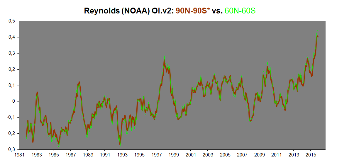
Figure 5.
– – –
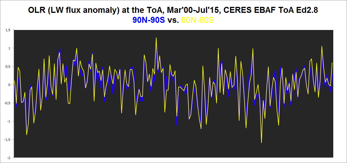
Update: And, significantly, neither is OLR at the ToA. Here’s the ToA LW flux anomaly in the 60N-60S band vs. the full global (90N-90S):
– – –
Which is perfectly reasonable and exactly what we would expect. The tropical/subtropical signal – basically ENSO – utterly and rigorously dominates the global average. This trivial fact is obvious almost no matter what climatically relevant parameter we look at. And it is a simple matter of size, consistency and causation. Earth’s tropical/subtropical band covers a much larger area than any other separate region or zone on the planet. It is where (most of) the Sun’s heat is absorbed by the Earth system and where it is subsequently distributed from. If there is “global warming” (or global cooling) going on, you can be sure it originated in the tropics.
The tropical/subtropical signal is further made all the more powerful through its strong internal concordance between its different basins, all pulling circumglobally in the same direction, basically forced to by the overwhelming potency of the ENSO process, naturally operating out of the Pacific portion.
In comparison, two 90-60 spherical caps even in combination only cover about 13.4% of the full surface area of a sphere. And, regarding temps at least, the Arctic and the Antarctic have tended to pull in opposite directions, offsetting each other’s influence rather than reinforcing it. While Arctic (90-60N) anomalies tend to climb at a substantially higher rate than the near global region of 60N-60S, Antarctic (90-60S) anomalies progress along a much gentler incline than the 60-60 band, in fact, they basically carry no trend at all.
As a result, the Arctic spherical cap essentially has to work against the Antarctic one in bumping up the global average, out of a region covering a mere 6.7% of the world, equal to 1/15 of Earth’s global surface. A hefty task indeed …
And as Figures 4 and 5 above both demonstrate, it is clearly a task too hefty to pull off; the Arctic is not able to notably influence the global mean, even with a steeper overall trend.
The HadCRUt3 dataset very much agrees with this pretty consistent pattern – no significant differences between the 60-60 band and the full global (90-90) set:

Figure 6.
While GISTEMP apparently does not agree. Not at all:
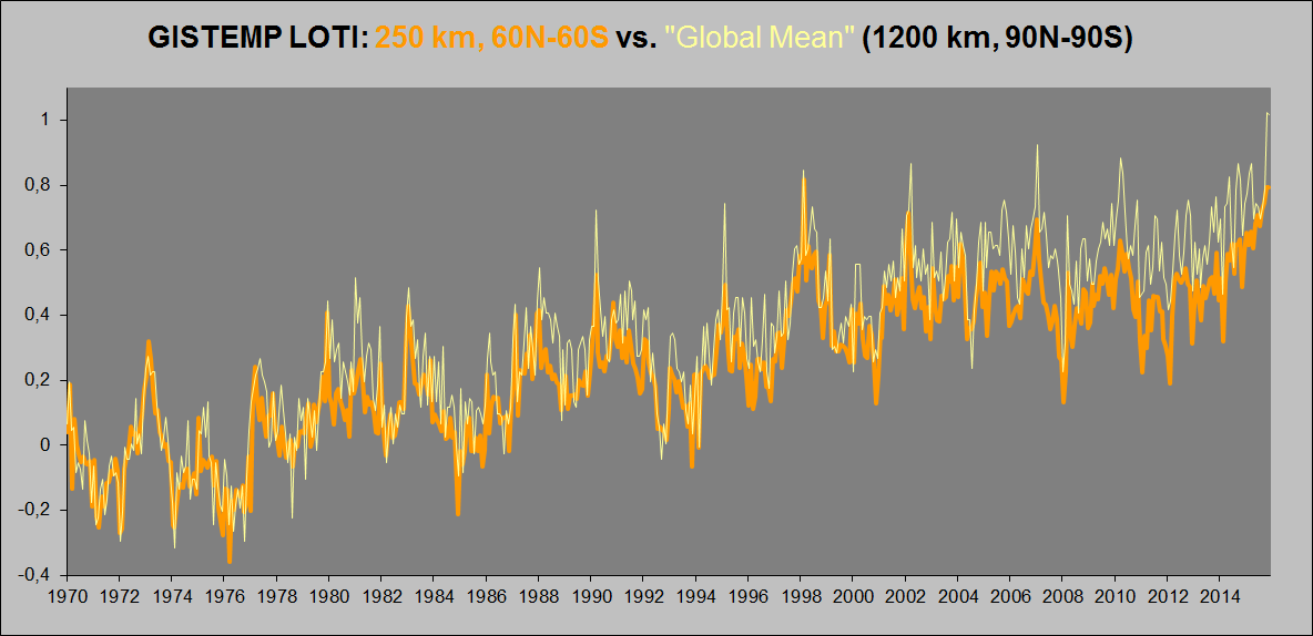
Figure 7.
Finally, just to confirm to ourselves that Antarctic temps indeed do not contribute to the curious discrepancy seen in Fig. 7 above, here’s a weighted plot of T2m+SSTa for the 60-90S cap region from 1982-2015:

Figure 8.
Which is in general agreement with the lower troposphere data (in fact, the tlt trend is more clearly trending in an ever so slightly negative direction, while this can only be said to be true for the surface since about 2000, the overall trend being essentially flat going back to 1982; might there be some UHI contamination in the land surface station measurements? (a relevant issue also in the Arctic)):

Figure 9. UAH tlt v6.0 (beta4), Antarctica (60-90S*), Jan’79 – Nov’15.
So, how to explain Fig. 7?
Bob Tisdale noted and tracked down the cause of the strangely inflated global trend in GISTEMP LOTI already back in 2010 and 2012, when he authored two blog posts titled:
- “GISS Deletes Arctic and Southern Ocean Sea Surface Temperature Data”
- “The Impact of GISS Replacing Sea Surface Temperature Data with Land Surface Temperature Data”
Both well worth a read.
Key quotes and figures from the posts:

Figure 10. (Tisdale’s Fig.3 from his post 1.)
Says Tisdale of this map set:
“Figure 3 shows four Arctic (North Pole Stereographic, 65N-90N) maps prepared using the map-making feature of the KNMI Climate Explorer. The maps illustrate temperature anomalies and sea ice cover for the month of September, 2005. The calendar year 2005 was chosen because it was used in the RealClimate post by Jim Hansen, and September is shown because the minimum Arctic sea ice coverage occurs then. The contour levels on the temperature maps were established to reveal the Sea Surface Temperature anomalies. Cell (a) shows the Sea Ice Cover using the Reynolds (OI.v2) Sea Ice Concentration data. The data for the Sea Ice Cover map has been scaled so that zero sea ice is represented by grey. In the other cells, areas with no data are represented by white. Cell (b) illustrates the SST anomalies presented by the Reynolds (OI.v2) Sea Surface Temperature anomaly data. GISS has used the Reynolds (OI.v2) SST data since December 1981. It’s easy to see that SST anomaly data covers the vast majority of Arctic Ocean basin, wherever the drop in sea ice permits. Most of the data in these areas, however, are excluded by GISS in its GISTEMP product. This can be seen in Cell (c), which shows the GISTEMP surface temperature anomalies with 250km radius smoothing. The only SST anomaly data used by GISS exists north of the North Atlantic and north of Scandinavia. The rest of the SST data has been deleted. The colored cells that appear over oceans (for example, north of Siberia and west of northwestern Greenland) in Cell (c) are land surface data extending over the Arctic Ocean by the GISS 250km radius smoothing. And provided as a reference, Cell (d) presents the GISTEMP “combined” land plus sea surface temperature anomalies with 1200km radius smoothing, which is the standard global temperature anomaly product from GISS. Much of the Arctic Ocean in Cell (d) is colored red [pink, really], indicating temperature anomalies greater than 1 deg C, while Cell (b) show considerably less area with elevated Sea Surface Temperature anomalies.“
(My emphasis.)

Figure 11. (Tisdale’s Figure 1 from his post 2.) Note that the ‘Deg C’ values along the y-axis represent linear trends of K/decade, not absolute (total) change in zonal temperatures from start to end date. You should basically multiply those figures by a factor of three to get the final difference.
Tisdale on this graph:
“The topic of discussion is the impact of GISS deleting sea surface temperature data in areas of the Arctic and Southern Oceans with seasonal and permanent sea ice and their replacing that sea surface temperature data with land surface temperature data, which naturally warms at a much higher rate. Figure 1 is a graph that illustrates the linear trends of the two relevant sea surface temperature datasets for the period of January 1982 to October 2011 on a zonal mean basis. It compares Reynolds OI.v2 sea surface temperature data, which is the source sea surface temperature data for the GISS LOTI product during that period, and the GISS LOTI data with the land surface temperatures masked. That is, it shows the source sea surface temperature data (Reynolds OI.v2 – in blue) and the sea surface temperature data after GISS has deleted the sea surface temperature data in areas of sea ice and replaced it with land surface temperature data (in purple). The methods used by GISS significantly alter the sea surface temperature data north of 50N and south of 50S.”
(My emphasis.)
What the graph in Fig. 11 shows, then, is that, south of ~55S and north of ~55N, GISS replaces what should’ve been pure SSTa (and sea ice sfc temp anomaly) data with pure land data anomalies. The land mask utilised by Tisdale effectively removes land data between 55S and 55N, but significantly not outside this band, where the opposite happens: sea data is deleted and replaced by land data!
Now relate the graph in Figure 11. above to the one below:

Figure 12. (Tisdale’s Figure 10 from his post 1.)
As you can see, the trend difference between GISTEMP 1200 km and HadCRUt3 is hardly noticable between ~55N and 55S, but pushing beyond those latitudes, the trend of the former all of a sudden skyrockets relative to that of the latter. How is this accomplished? By taking advantage of the dire lack of land surface temperature data in these regions and by at the same time deleting actually available adjacent sea surface temperature data, in order to let a few single – very likely in many instances considerably UHI-contaminated – land based data points dictate the apparent temperature evolution of vast areas of land AND ocean/sea ice.
Bear in mind that, if there are no other data points than one within a radius of 1200 km, something which effectively never happens in the 60N-60S band, but which is a real issue in the Arctic and Antarctic, then the temperature readings from that one station, using GISS’s interpolating/extrapolating methodologies, is potentially smeared across a region upwards of 4.5 million square kilometres in surface area (nearly the size of Europe outside the former Soviet Union)! Refer to Fig. 10 above, where in map (d), the weather station of Eureka on the Fosheim Peninsula of Ellesmere Island, seen as a lonely northern pink grid cell in the Canadian Arctic in map (c), is allowed to singlehandedly define the temperature anomaly of a huge stretch of land, ice and sea extending almost from the north coast of the Canadian mainland to the North Pole and from the northwestern part of the Greenland Ice Sheet to the Beaufort Sea, creating a pink blob seemingly covering an area of about 3 million square kilometres!
What’s happening, then, is GISS effectively inventing massive extra warming out of nothing (it isn’t really there!) outside the 60-60 band to inflate their global (90-90) mean temperature trend. They do it mainly in the Arctic, but also somewhat in the Antarctic. There simply is no way to justify why there should arise such a huge trend difference in temperature anomalies in merely going from a near global (60N-60S) to a full global (90N-90S) product, as suggested in Fig. 7 above.
Finally, how come the corrected (-0.064K from Jan’98) “HadCRUt3 gl” dataset matches up so well with:
- The GISTEMP LOTI 250 km, 60N-60S?
- The gl lower troposphere temp anomalies?
- The gl CERES EBAF OLR at the ToA data?
 Figure 13.
If it’s really that outdated (i.e. ‘wrong’)?
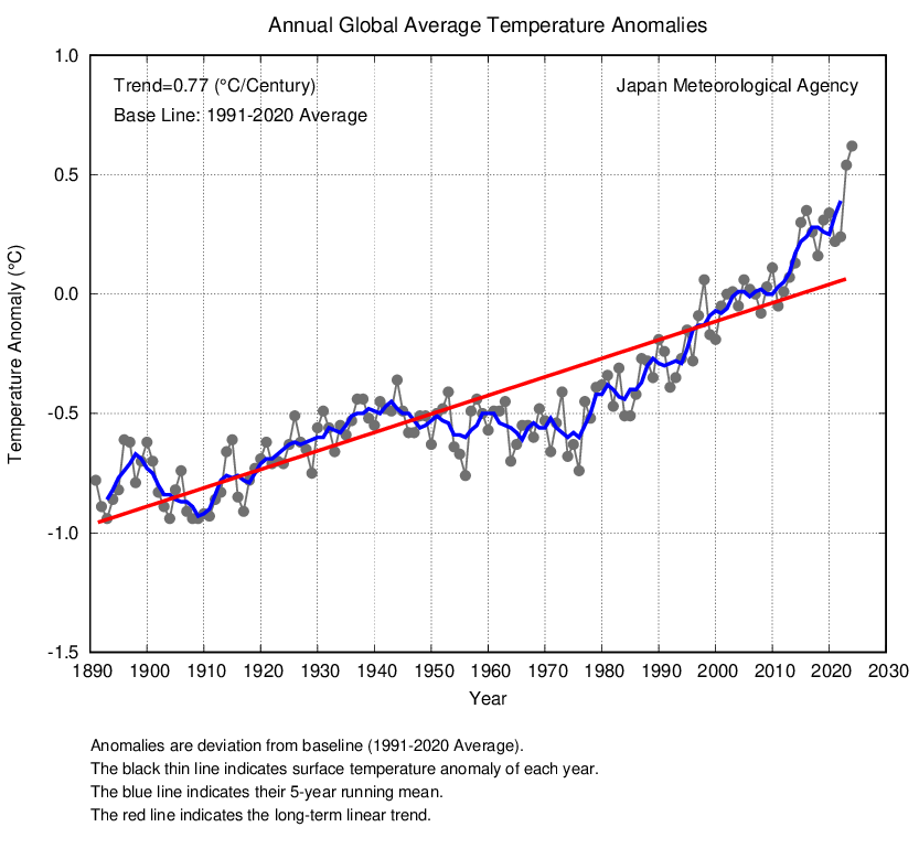
As it happens, the Jan’98> downward adjustment of the “HadCRUt3 gl” dataset is additionally supported by the JMA (“Japan Meteorological Agency”) and its global average temperature anomaly product:

Figure 14. JMA annual global average temperature (gray curve and dots) from 1970-2014 (cutout from the original graph), overlain by the annual HadCRUt3 gl curve (lime) from 1970-2013, specifically down-adjusted 0.064K from 1998 on.
To underscore this (strangely unnoted) fact, here you can see how – post 1997 – the JMA curve (purple) appears to track substantially and decidedly below the rest of the heap – NASA GISS (red), UEA/UKMO HadCRUt4 (blue) and NOAA NCDC (light green) – by about 0.1-0.15 degrees:

Figure 15. Original graph from NASA. GISS, red; NCDC, light green; HadCRUt4, blue; JMA, purple.
HadCRUt4 should’ve been down there with JMA rather than up there with GISS and NCDC. If it had been appropriately adjusted down as of January 1998. But as we know, it never was. Such an initiative has never even been suggested by the UKMO or the UEA, the joint proprietors of the HadCRUt dataset, as something that might perhaps be a thing to consider. Because it never suited them to do so. And it never will. It would simply water down their overarching narrative. Their narrative of a strong, continuing (ongoing) process of “(anthropogenic) global warming”. That’s their message. The message that they want to convey to the world. An altogether artificially produced warming such as the 1997-98 step would never be amended. Not in a million years. The swift correction of the opposite, a spurious cooling, however, would always be loudly and widely advertised as a necessary measure to uphold the quality of the record and thus to maintain its keeper’s scientific integrity.
Funnily enough, even the broiling “GISTEMP LOTI global mean” series unambiguously verifies the need for a “HadCRUt3 gl” downward adjustment across the 1997-98 transition. Here are the two series as plotted in Fig. 1, only now starting out more or less on even ground, so to say, pretty much aligned in 1970, so that we’re able more directly to observe how they gradually diverge from this point on:

Figure 16.
The first thing you’ll notice is how the red GISS curve soon appears to drift upward relative to the green HadCRUt3 curve, starting around 1975. Some twelve-thirteen years later, this prolonged and subtle shift has finally raised the former by something quite close to 0.064 degrees (!) above the latter. If we then were to offset the HadCRUt curve to make up for this upward shift, we would see something very interesting:

Figure 17.
Watch how the GISS and HadCRUt curves now track each other almost perfectly from 1995 to 2005 (indeed, back even to at least 1987, maybe even 1980). You can see it more clearly here:

Figure 18.
This is what we’ve been pointing out all along: The HadCRUt3 gl series sees a spurious warming of 0.064 degrees across the 1997-98 transition due to the UKMO’s Hadley Centre switching data sources for its SST product at this time. Correct the resulting calibration error (like I’ve done here, and have done consistently since the start of this blog) and your series will once again agree with the others, in this case GISTEMP.
What GISS and HadCRU have – apparently – come up with, though, is a way to leave the spurious warming step in the latter unremedied without making it seem too obvious to the general public. How?
First, here’s “GISTEMP LOTI global mean” vs. “HadCRUt3 gl” uncorrected from 1970-2005:

Figure 19.
Do you see it?
Watch how the two series line up quite neatly during the first half of the 70s AND from 1998 to 2005, the first and last segments of this graph, but not that well in between, GISS generally tracking somewhat higher from 1975 to 1997. However, the overall rise from the 1970-75 segment to the 2000-05 segment is the same in both series. Exactly the same, it seems. Which is remarkable, considering that both independently lift their curve relative to the other during the intervening period, only at different times. Which means that these two separate lifts (the GISTEMP one starting in 1975, but fully established only in 1987/88; the HadCRUt one occurring rather more abruptly in 1997/98) just so happen to be of equal magnitude, exactly offsetting each other, so that both series ends up with an ‘extra’ warming going from 1970-2005 of +0.064 degrees …!
Now, this scheme worked fine until about 2004/05. Beyond that time, however, the “Pause” gradually started becoming a problem. The HadCRUt3 series post 1997 began to look way too plateau-like. The people at NASA GISS (and eventually the people at the UEA/UKMO) simply could not accept this frightful – but oh so natural – development. They saw their ideologically driven “global warming” narrative crumbling before their eyes.
And so they (GISS, that is) went to work and started tilting their series ever upward (and remember, this injection of ‘extra warming’ is performed solely in the data-depleted regions outside the central 60N-60S band; on the inside, where practically all members of the human race live, you just cannot see it!):

Figure 20.
This progressive deviation ultimately necessitated an ‘upgrade’ also to the HadCRU global temperature product. HadCRUt3 was officially retired and a new and ‘improved’ version 4 was drummed up to take its place, its sole purpose quite evidently to restore the general agreement between the two main global temperature records post 2004. As can be realised from this plot:

Figure 21.
Well, they managed for quite some time. But after the continued upward adjustments at the hands of GISS over the last few years, squeezing out another +0.03K of their 2001-2015 trend, even H4 can no longer fully follow “GISTEMP LOTI global mean” on its soaring path towards the sky, as can be witnessed in Fig. 21 above.
Soon time for another upgrade, perhaps …?
* * *
A merry Christmas to everyone!

This is a great post. Most interesting. It took me a while to digest it all. I think it needs wider consideration.
Merry Christmas to you and yours.
~ Mark
mark’s comment on this article at wuwt drew me.
i enthusiastically agree with his evaluation.
(the article is a bit of a read, but not complicated at all – easily understood)
(it’s a matter of academic interest and has no bearing on the progressive voracity of the cannibal class.)
Hej Okular
Both NOAA,GISS,HadCruft are political climate institutions fighting for global warming tampering the temperature.
I
However in the HadCruft3 we are seeing a standstill in global surface temperature beginning 2001. On that time we have the beginning of the deep prolonged Minimum in solar cycle 23!!
So, the weakness in the suns magnetic activity initiate a terrestrial response a standstill in global surface temperature and it will proceed as a cooling.
Does your Hadcrut4 ‘upgrade’ conclusion also mean that Roy Spencer’s ‘upgrade’ to V6 was also ‘drummed up, its sole purpose quite evidently to restore agreement’ between UAH & RSS?
Hehe, I can see why you might think that. But, you need to see the direct reasoning behind the correction. UAH version 5.6 was simply flawed, and it was easy to see. Even before Spencer and Christy published their new version 6, I wrote the following post to explain exactly why their version 5.6 needed some serious adjusting:
Note how close my suggested UAH update curve in Fig.10 is to their actual new version 6. I’m still pretty proud of that one …
You will also notice how close (both RSS and) UAH match(es) the CERES EBAF ToA Ed2.8 OLR data from 2000:

So UAHv6 definitely ‘restored agreement’ between UAH tlt gl and CERES gl OLR at ToA. After all, flawed version 5.6 was way off.
[…] were talking about the same planet. In comments, mark stoval, posted a link to this article, Why “GISTEMP LOTI global mean” is wrong and “HadCRUt3 gl” is right“, who’s title speaks for itself and Bob Tisdale has a recent post, Busting (or not) […]
A brilliant piece of work. Thanks on behalf of one and all.
It says all the action is outside the 60-60 band. If you consider that all the temp, gravity, mag and seismic maps rather strongly suggest the climate on surface is a function of mag shifts in the non-dipole field in the molten metal ocean below, and that magnetic intensity shifting drags the N mag pole back and fort between the big East Siberian and Hudson Bay anomalies, I think we have it. The engine is tidal, with the barycentre trekking up an down through the mantle, top to bottom, since the moon arrived – hence the mantle. A three body problem the barycentre,track, not a two body one. The sun’s gravity at this distance is half that of the moon, so a very elegant waltz.The internal heat is not from uranium or leftover hot breath of sky gods, so there is our future power source, Cable drilling, upgraded nineteenth century stuff, can be a hundredth the cost of rod drilling. No need to waste fossil fuel by burning it, no more oil wars needed. Carbon is innocent, the heat is from hell. Were it not, no us.
Peter Ravenscroft,
Geologist, Ravenswood, Closeburn, Queensland. Phone 617 3289 4470